Point and figure charts are one of the great tools many technical traders overlook. I have followed them since I was 15 years old due to my father’s love for the technique. He would plot hundreds of charts each year by hand in a graph book prior to computers in the 1970’s and 1980’s. He taught me about the charts and the key support and resistance areas to look for when scanning for opportunities. I found this old case study I did in 2005 and thought it would serve as a perfect example of the power of point and figure charts.
The chart was sounding a buy on 5/4/05 even though the stock had already moved from $20 to $60. Would you have bough? I did as did many MSW members that e-mailed me. See the updated chart below to see what HANS went on to accomplish.
For today’s exercise, please understand that I didn’t highlight every single breakout on the P&F as that would have cluttered the Hansen Natural (HANS) chart. However, I did highlight the obvious, stronger breakouts that were confirming this stock’s strength time and time again. No one should have missed HANS in 2004 and 2005 if you were trading this chart along with basic price and volume.
Follow along with the legend below and start to learn about the world of point and figure charts. I bet you won’t stop using them once you learn the benefits and accuracy that they can add to your more traditional technical analysis tools.
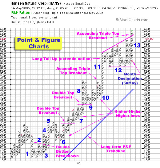
Please note that this chart was originally featured as a case study for MSW back in May 2005 when HANS was trading at $64.09 (pre-splits).


Connect with Me