Start Here: Top 20 Posts

I went back and tried to pick out the best 20 posts that new readers can start with when coming to this website. I will be permanently placing them at the top right sidebar.

Top 20 chrisperruna.com Posts

Let me know if I am missed an article that you believe should be on this list.

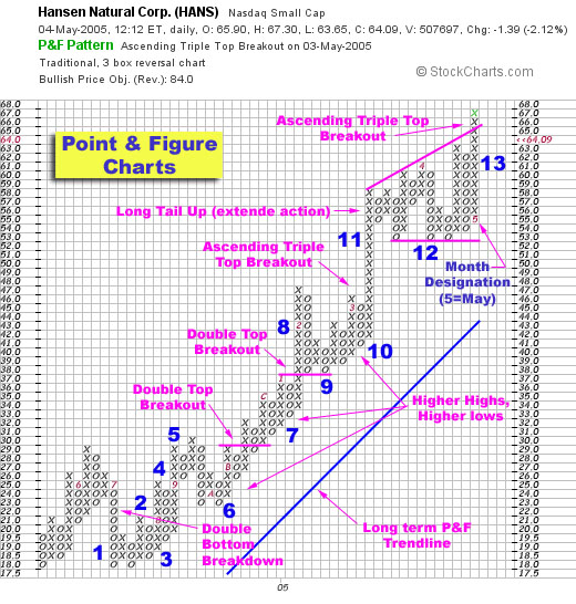
Point and Figure Charts

A point and figure chart is:

“A chart that plots day-to-day price movements without taking into consideration the passage of time. Point and figure charts are composed of a number of columns that either consist of a series of stacked Xs or Os. A column of Xs is used to illustrate a rising price, while Os represent a falling price. This type of chart is used to filter out non-significant price movements, and enables the trader to easily determine critical support and resistance levels. Traders will place orders when the price moves beyond identified support/resistance levels.”

Investopedia

“Additional points are added to the chart once the price changes by more than a predefined amount (known as the box size). For example, if the box size is set to equal one and the price of the asset is $15, then another X would be added to the stack of Xs once the price surpasses $16. Each column consists of only one letter (either X or O) – never both. New columns are placed to the right of the previous column and are only added once the price changes direction by more than a predefined reversal amount.”

Investopedia

102906_nasdaq_ttb.png

I use point and figure analysis every night while scanning my charts because I can easily determine key support and resistance levels. Many indicators can trigger buy and sell signals but I stick to the basics and only trade a few patterns that the point and figure charts offer, such as the ones described below (see chart examples as well).

Understand that I use point and figure charts as a secondary technical analysis tool behind candlestick charts (both daily and weekly). I view point and figure charts (will be referred to as a P&F from this point forward) after I find an interesting stock that has already passed my fundamental criteria and peeked my interest on the candlestick charts. Support and resistance levels can be found using basic candlestick and bar charts but P&F charts eliminate the unimportant noise by setting-up the critical levels and breakouts or breakdowns with the more important (larger) moves.

My favorite pattern setup is the Triple Top Breakout which occurs when a stock hits a certain level of resistance on three separate occasions, telling me that a move above this zone has some meaning. Not every triple top breakout will be successful but the odds of a breakout above this setup increase dramatically. As with all trading, you must take the signal with proper position sizing and set your stops without thinking like a human.

[Read more…]

Support and Resistance

Stock of the Day – Update
Rochester Medical (ROCM)
Monday’s Closing Price: ROCM – $14.75

Potential Trade Set-up:
Ideal Entry: NOW (currently $14.75)
Risk is set at 1.0% maximum of total portfolio or $1,000 of $100k
Stop Loss is 5% or $14.01
Number of Shares: 1,356
Position Size is $20,000
Risk is $0.74
Target is $21
Risk-to-Reward is 8-to-1

071707_rocm_daily.png

I am providing this potential trade update with the latest trade setup that allows the previous gap-up to be considered (pointed out by a reader: dankkir, “nobody here mentions the gap at 14.19 which needs to get closed before any long term upside…its just another 5% away“). The entire trade has the potential to fall apart if the overall market starts to tank so be ready to cut losses. However, don’t anticipate anything; follow your rules and the trade parameters.

Take a long look at the support and resistance line on the point and figure chart provided. It tells me that the stock is going to blast higher for a triple top breakout or get slammed lower for triple bottom breakdown.

Too bad we can’t play options here (not offered) because I would trade a move and wouldn’t care what direction it went in, as long as it moved. As Taylor says: “Looks like it’s about to fall off a cliff to me.” If that were the case, a straddle would work.

I would create a straddle – remember; I am not a great option’s trader so don’t listen to what I am saying as I am still learning (please chime in if you see a better strategy using options if they were available in this case)!

Long Straddles (definition from optionsXpress):
Have you ever had the feeling that a stock was about to make a big move, but you weren’t sure which way? For stockholders, this is exactly the kind of scenario that creates ulcers. For option traders, these feelings in the stomach are the butterflies of opportunity. By simultaneously buying the same number of puts and calls at the current stock price, option traders can capitalize on large moves in either direction.

Here’s how this works. Let’s imagine a stock is trading around $80 per share. To prepare for a big move in either direction, you would buy both the 80 calls and the 80 puts. If the stock drops to $50 by expiration, the puts will be worth $30 and the calls will be worth $0. If the stock gaps up to $110, the calls will be worth $30 and the puts will be worth $0.

The greatest risk in this case is that the stock remains at $80 where both options expire worthless.

071707_rocm_pnf.png

Point and Figure Exercise – HANS

Point and figure charts are one of the great tools many technical traders overlook. I have followed them since I was 15 years old due to my father’s love for the technique. He would plot hundreds of charts each year by hand in a graph book prior to computers in the 1970’s and 1980’s. He taught me about the charts and the key support and resistance areas to look for when scanning for opportunities. I found this old case study I did in 2005 and thought it would serve as a perfect example of the power of point and figure charts.

The chart was sounding a buy on 5/4/05 even though the stock had already moved from $20 to $60. Would you have bough? I did as did many MSW members that e-mailed me. See the updated chart below to see what HANS went on to accomplish.

For today’s exercise, please understand that I didn’t highlight every single breakout on the P&F as that would have cluttered the Hansen Natural (HANS) chart. However, I did highlight the obvious, stronger breakouts that were confirming this stock’s strength time and time again. No one should have missed HANS in 2004 and 2005 if you were trading this chart along with basic price and volume.

Follow along with the legend below and start to learn about the world of point and figure charts. I bet you won’t stop using them once you learn the benefits and accuracy that they can add to your more traditional technical analysis tools.

050405_hans_pnf.jpg

Please note that this chart was originally featured as a case study for MSW back in May 2005 when HANS was trading at $64.09 (pre-splits).

[Read more…]

A Natural Correction or Top?

On May 24, 2007, I wrote an article titled: Are We Nearing a Top

In that article, I said:
“I am not sure if this WSJ article will signal a top but I tend to agree with Barry that this type of front page coverage has a history of signaling things to come.”

“…keep an eye on this performance chart to make sure the up-trend doesn’t extend too far without a natural pullback”

“The second chart shows the NASDAQ reaching a 28% gain over a year ago which has signaled tops in the past. Eugene D. Brody, from Oppenheimer Capital, was quoted as saying: “Sell stocks whenever the market is 30% higher over a year ago”.”

So, what can we make of the market over the past several days?

  • First, the market looks to be making a natural intermediate correction which has been overdue in my personal opinion (remember, the action in the market is only a belief in your own mind).
  • Second, the markets are extended (up 25%+) when compared to their levels from last year and I have been highlighting this fact over the past several weeks. Corrections are due when markets move up by 30% over their levels from the prior year.
  • Finally, the markets can’t continue to trade too far above their 50-d and 200-d moving averages without making a pullback, even if it only last a few days to a couple weeks. They can continue to trend higher but pullbacks are a must in order to achieve sustainability. Welcome pullbacks and add shares in ideal situations.

If you follow my annotated charts over on stockcharts.com, you may have noticed the fact that the 50-day moving average for crude oil has recently crossed above the longer term 200-day moving average (a sign that oil prices may push higher). The 200-d moving average is still facing south but things are starting to look better which usually means that stocks “as a whole” may be poised to take a breather or actually trade lower.

060707_crude_daily.png

Let’s take a look at several charts:

The NASDAQ is now trading a few points above its 50-d moving average and has not traded below this line since its last correction in late February 2007. That correction was short lived but did give back 8% in gains as this week’s losses have totaled less than half of that.

060707_nas_wkly.png

060707_nas_daily.png

060707_nas_29per.png

I did miss one BIG signal that highlighted a weak market over the past several months: a bearish divergence between the NASDAQ and its relative strength versus the S&P 500. As the index moved higher, the relative strength drifted lower; not a very promising occurrence.

060707_nas_div.png

The DOW was down about 3% for the week on above average volume which gives us pure distribution. Looking at the point and figure chart, I see one support level near 13,200 and then a possible free-fall towards 12,800 or 12,750 when overlaying the weekly candlesticks. The 200-day moving average sits near 12,400, an area I would rather not visit at this time.

060707_dow_daily.png

060707_dow_pnf.png

Do I think the up-trend is over?
It doesn’t really matter what I think when you can follow the indicators above. However, I’ll give you my beliefs: The up-trend is making a natural correction and Wall Street analysts and newspapers are freaking. Corrections such as this are welcomed as they allow investors to accumulate shares in the top candidates before they resume their runs.