Market Breadth using the New High New Low ratio and the Cumulative Advance Decline line for the NYSE and NASDAQ.
I’ll let the charts do the talking…
A blog about trading, finances, success and life itself
Market Breadth using the New High New Low ratio and the Cumulative Advance Decline line for the NYSE and NASDAQ.
I’ll let the charts do the talking…


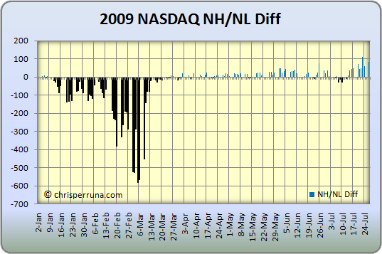
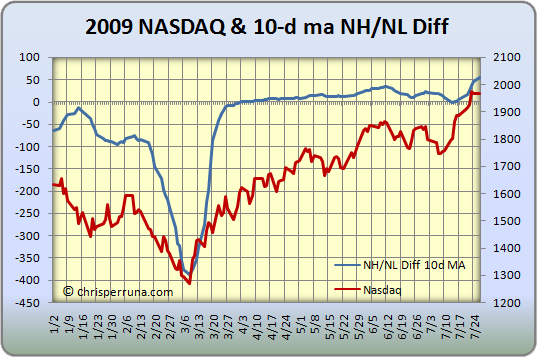
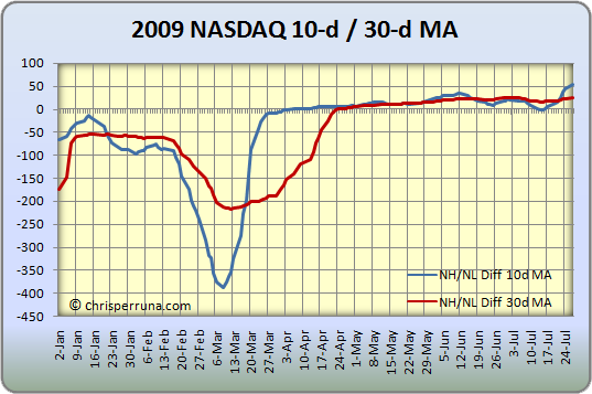
There are always several ingredients that can tell the story of a possible market bottom or tools that allow us to spot a new up-trend even if it is only a bear market bounce (a sustainable bounce). As you know, I have been monitoring the NH-NL differential very carefully over the past few months as it has turned positive for the first time in well over a year. It remains weak and has not screamed buy but it is still etching higher, ever so slowly. The charts in the post titled NH-NL Picks Market Tops and Bottoms show clearly how weak the differential has been since 2007.
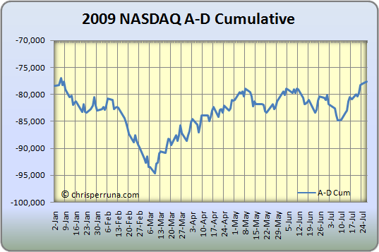
A secondary indicator, the cumulative advance decline line, is one I have been studying since late last year. I didn’t use this tool in past markets because I wasn’t too familiar until I picked up a book by Justin Mamis, The Nature of Risk (which I highly recommend – quickly becoming one of my personal all-time favorites).
Several ingredients that can signal a bottom include:
In addition to the items above, some secondary indicators can work alongside price action, volume and the NH-NL Differential. This is where the Cumulative A-D line and divergences can help confirm the main indicators.
The lesson is that indicators exist in a real, everchanging world. They are not so definable that you can put them in a computer, with parameters that ring bells, because a human being still has to interpret their subtleties. But a few indicators do still work, the most important of which can be described as the divergence pair. – Justin Mamis
As Mamis notes, they work because they are statistical summations of what the individual stocks are actually doing. Essentially, this is exactly what price and volume tells us (real time information of what the market is doing). Lastly, the NH-NL ratio packages that information and lets us get a true reading for a possible trend (the NH-NL does lag price and volume slightly).
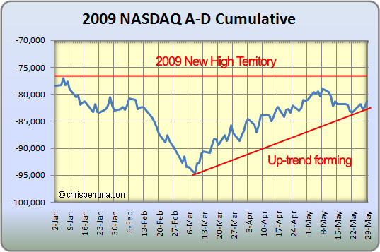
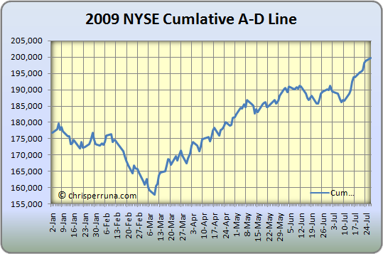
Looking at the 2009 NASDAQ Cum A-D Line, we can see that an up-trend is forming but it is not in new high territory yet. However, the NYSE line is in new high territory, which Brian Shannon of alphatrends pointed out last week in this chart.
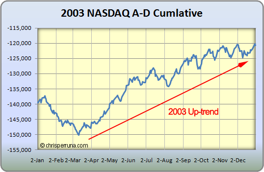
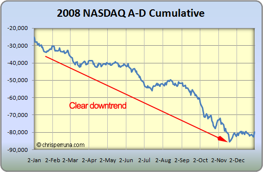
The point of this post is to show you the similarities of the 2002 and 2008 markets versus 2003 and 2009 markets. It’s very interesting to see that the 2003 market had a bottom in Cum A-D line in March and made a new yearly high in late May. Well, this year’s Cum A-D line made the low in March and is trying to make a new high here in early June, very similar.
The same findings were true when I posted up the charts for the differential last month. Only time will tell what’s going on but things are slowly changing from 2008. Let’s keep watching and get ready to pounce if and when the ultimate buy signal appears.


Born and raised in New York but now living in New Jersey with a beautiful & loving wife, and two fantastic kids (boy and a girl). This site is about the stock market, success and life … [Read More...]
Copyright © 2024 on Genesis Framework · WordPress · Log in
Connect with Me