A Negative New High – New Low Ratio (NH-NL)

The New High – New Low (NH-NL) Ratio plummeted into negative territory for the first time since early March and closed at its lowest point since July of 2006. Is it a coincidence that the ratio is dropping to its lowest level since the start of the most recent up-trend in July 2006? Could the NH-NL ratio be marking the beginning and the end of the strong run from 2006 to 2007?

*click the image for a larger view*

080207_nh-nl_ratio_sm.PNG

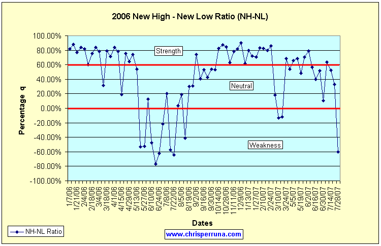
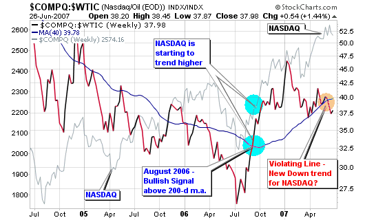
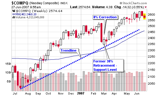
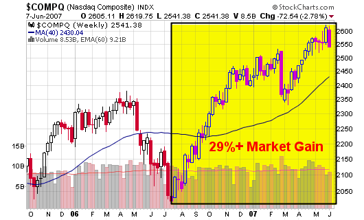
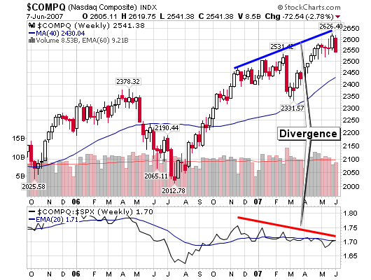
The 30% rise in the NASDAQ started in July 2006, precisely when the NH-NL ratio was building a base before blast off into a territory labeled strength on the accompanying chart. Aside from a few swings and a quick blip in February, the NH-NL ratio has stayed at or near the 80% strength calculation as late as the June 2007.

The NASDAQ corrected for four months in the spring of 2006, the same period of time that the NH-NL ratio decided to play see-saw in the area labeled “weakness” on the chart. The index did violate the 200-day moving average in the spring of 2006 so the downtrend should have been expected; so, we will now have to watch the present action to determine if the current market would like to follow a similar pattern.

080207_nas_wkly.png

The NH-NL ratio averaged a negative (32%) rating from May 20, 2006 to August 12, 2006 with a bottom reading of (76.64%) ending the week of June 17, 2006. Last week’s NH-NL ratio gave us an average of 572 new lows per day, the largest reading since I started tracking this information on the blog (several years). Last week gave us a negative percentage reading of (60.34%) which was better than June’s low but that was due to the higher number of new highs in the calculation. We only averaged 310 new lows per day during the bottom of the 2006 market, 45% fewer new lows than last week.

We had a reading of 79 new highs and 939 new lows last Thursday, one of the weakest readings I have recorded over the past several years. We must date back to the bear market of 2000-2002 to see these types of numbers. I will be searching my data for a reading of 1,000+ new lows in one day over the past several years to see what happened immediately following such an extreme level.

So what does this all mean?

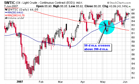
It means that the market should be ready to correct by 10% based on the history of my NH-NL studies. I admit that my studies of this indicator only stretch this decade but they have been extremely reliable. Tie this together with the fact that crude oil is making new all-time highs and the fact that the NASDAQ and DOW are still near multi-year highs and a yearly gain hovering near 30%. The complete list of weekly NH-NL ratios are located at the bottom of this post (or through the link).

[Read more…]

NASDAQ Stocks show Moving Average Divergence

Another secondary indicator is pointing to an exhausted market that is due for a correction or pullback but please understand that this is only a secondary indicator.

Looking at the two charts below, we can see that percentage of stocks trading above their 50-day and 200-day moving averages has been slipping as the NASDAQ moves higher. This action concerns me along with other data that suggests the market is heading for a correction or consolidation. I understand that the trend is still higher and I am still long several positions in my own personal portfolio so I haven’t jumped the gun on selling based on any secondary indicator but I am on alert.

Let’s study the first chart for a second:
The percentage of NASDAQ stocks trading above their 50-day moving average

070207_above_50d.png

As you can see, the number of stocks above this level reached a peak of 67.81% in October of 2006 as the NASDAQ was trading near 2,300. Since then, the number of stocks trading above this level has gradually decreased from 67% to 46%. The NASDAQ has gone from 2,300 in October to 2,600 in recent weeks yet the number of stocks above their 50-d moving average has slipped by 31% (market gained 13%). I will ignore the volatile swing from February of this year and concentrate on the overall monthly trend.

The number of stocks slipping below their 50-day moving average since April 2007 has gone from 59% to 46% while the NASDAQ has gone from 2,500 to 2,600. Anyone can see the divergence that has occurred over the past three months and certainly over the past eight months. It is not normal for the NASDAQ to move higher without a strong underlying support system.

What does this tell me?

It tells me that the weaker stocks are starting to drop below their 50-day moving average support level which indicates that the market leaders and general market may soon follow. Market leaders generally slip below their support levels after the weakest stocks have already pulled back. Leaders tend to drop last and blast off first.

Let’s look at the next chart:
The percentage of NASDAQ stocks trading above their 200-day moving average

070207_above_200d.png

Here we see a chart that is similar to the one above over the past three months but slightly different when going back to last year. It concerns me even further that the number of stocks above this longer term moving average support line has been dropping quickly over the past two months while the NASDAQ pushes higher.

The percentage of stocks above this line has gone from 57% in early April to 48% on Friday (a 15% drop). However, the NASDAQ has gone from 2,500 to 2,600 over the same period of time.

I can’t honestly sit here and say that the market is going to correct in two days, two weeks or two months but I also can’t ignore such red flags that continually appear on secondary indicator charts. I will continue to hold my positions until the primary indicator of price and volume confirms but I will be watching closely!

*FYI: The price of the NASDAQ is in the shaded gray area of each chart if you weren’t aware.

NASDAQ and Crude Oil Combo Index

I am revisiting a combo index chart that I highlighted numerous times last summer as the NASDAQ started a new leg up since the bull market in 2003. I described the chart as such in a post titled Can the NASDAQ – Crude Oil Index predict Bulls & Bears in June of 2006:

The chart is a combination index that I created using Stockcharts.com advanced tools. It combines the average close of both the NASDAQ and crude oil contracts over the past 10 years with a 200-d moving average. As you can see, the progression of this chart has called every major up-trend and downtrend before it was about to happen. The gray line on the chart represents the actual close of the NASDAQ index over the past 10 years (this line varies from the combo index).

062707_nas_crude_yrly.png

Viewing the current progression of the chart, we can see that the combo index is violating the 200-day moving average for the first time since last summer (August 2006) when the NASDAQ was trading about 20% lower than current levels. Looking back, the NASDAQ has always corrected, even slightly when the combo index crosses back below the 200-d moving average. Please see all red highlighted circle areas on the yearly chart. Our best idea of what may happen can come from the action back in late 2003 and early 2004. The NASDAQ made a multi-month consolidation before trending higher again.

The NASDAQ has gained more than 100% since the low in late 2002 and this is the first time since the bubble burst that the combo index is trading above the long term trendline (dotted black line) so things may be different this time around.

No one knows what will happen but I will remain cautious since this secondary indicator has been fairly accurate over the past ten years. Couple that with the fact that the NASDAQ is trading about 30% higher than it was last year at this time and the fact that crude oil is trending higher in a yearly cup shaped base. Many indicators scream correction but the market keeps trending higher. Price and volume will remain the primary indicator!

062707_nas_crude.png

This post, Will the NASDAQ be 50% higher in 6-12 months? details some more information about the mysterious combo index that I follow as a secondary indicator:

…The combo index highlighted the relationship of the two indexes and actually told us on a higher level when and where the market was making rallies or starting major down trends over the past 10 years.

062707_crude.png

I asked this question on August 23, 2006:
Will the NASDAQ be 50% higher in six to twelve month from this year’s bottom?

Well, it didn’t gain 50% but it did manage to tack on 30% – NOT TO SHABBY!

062707_nas.png

Don’t be Greedy

I have talked numerous times about the market moving 30% higher than it was last year and how this is a warning of a pending correction in the near future.

I want you to understand that I can’t pick a top and I don’t know when a top will occur but be prepared. That’s all I can do to help my readers.

061907_nas.png

With that said, I am starting to read some very cocky blogs that are posting up their “amazing” winning stock “picks” over the past few months. This is fine as I too have posted my best trades and stock selections from 2006 and 2007 but I understand the difference between success and some market luck.

I tend to agree with Howard Lindzon’s post today, GREED on Wallstrip…A Parody of A Few Good Men, as he states:
“The main thing is don’t get caught up in the hysteria of great markets. You are not that smart. The markets are making you money.”

I completely agree with his statement and always repeat the cliché:
“Don’t confuse brains with a bull market”

061907_dow.png

The market is good; it has been trending higher for months and everyone should be making money. If you are not, something is very wrong with your system, your approach or your mental makeup towards trading.

Whatever your portfolio has done, understand that the market should get most of the credit for your recent gains and your emotions need to eliminate the sense of superiority and greed. I can’t stress enough how you must protect your profits when the general market is up 30% over its levels from last year. Set hard physical stops and don’t chase extended stocks even if they have excellent fundamental and technical characteristics. I am currently having this struggle with Shutterfly (SFLY). I missed the ideal risk-to-reward setup so I must let it go. I am not going to post a case study either, unless it sets up another ideal entry. Don’t chase extended stocks, especially at this phase of an up-trend.

A couple Jesse Livermore quotes:
“There is nothing more important than your emotional balance”
“But careful timing is essential…impatience is costly”

061907_performance.png

With that said, I know my profits in stocks such as MA, BIDU and EDU have a lot to do with the overall market gains, not my intellect.

A Natural Correction or Top?

On May 24, 2007, I wrote an article titled: Are We Nearing a Top

In that article, I said:
“I am not sure if this WSJ article will signal a top but I tend to agree with Barry that this type of front page coverage has a history of signaling things to come.”

“…keep an eye on this performance chart to make sure the up-trend doesn’t extend too far without a natural pullback”

“The second chart shows the NASDAQ reaching a 28% gain over a year ago which has signaled tops in the past. Eugene D. Brody, from Oppenheimer Capital, was quoted as saying: “Sell stocks whenever the market is 30% higher over a year ago”.”

So, what can we make of the market over the past several days?

  • First, the market looks to be making a natural intermediate correction which has been overdue in my personal opinion (remember, the action in the market is only a belief in your own mind).
  • Second, the markets are extended (up 25%+) when compared to their levels from last year and I have been highlighting this fact over the past several weeks. Corrections are due when markets move up by 30% over their levels from the prior year.
  • Finally, the markets can’t continue to trade too far above their 50-d and 200-d moving averages without making a pullback, even if it only last a few days to a couple weeks. They can continue to trend higher but pullbacks are a must in order to achieve sustainability. Welcome pullbacks and add shares in ideal situations.

If you follow my annotated charts over on stockcharts.com, you may have noticed the fact that the 50-day moving average for crude oil has recently crossed above the longer term 200-day moving average (a sign that oil prices may push higher). The 200-d moving average is still facing south but things are starting to look better which usually means that stocks “as a whole” may be poised to take a breather or actually trade lower.

060707_crude_daily.png

Let’s take a look at several charts:

The NASDAQ is now trading a few points above its 50-d moving average and has not traded below this line since its last correction in late February 2007. That correction was short lived but did give back 8% in gains as this week’s losses have totaled less than half of that.

060707_nas_wkly.png

060707_nas_daily.png

060707_nas_29per.png

I did miss one BIG signal that highlighted a weak market over the past several months: a bearish divergence between the NASDAQ and its relative strength versus the S&P 500. As the index moved higher, the relative strength drifted lower; not a very promising occurrence.

060707_nas_div.png

The DOW was down about 3% for the week on above average volume which gives us pure distribution. Looking at the point and figure chart, I see one support level near 13,200 and then a possible free-fall towards 12,800 or 12,750 when overlaying the weekly candlesticks. The 200-day moving average sits near 12,400, an area I would rather not visit at this time.

060707_dow_daily.png

060707_dow_pnf.png

Do I think the up-trend is over?
It doesn’t really matter what I think when you can follow the indicators above. However, I’ll give you my beliefs: The up-trend is making a natural correction and Wall Street analysts and newspapers are freaking. Corrections such as this are welcomed as they allow investors to accumulate shares in the top candidates before they resume their runs.