Secondary Indicators telling Stories

The New High � New Low ratio (NH-NL) had its highest average number of new highs last week with a final tally of 541-55. It was only the fifth week of the year that had new highs average 500 or more stocks per day. It was also the highest new highs weekly average since the spring of 2005 (prior to me publishing the breakdown with the NH-NL chart). Daily new highs topped 613, 756 and 620 during the middle of last week for the best three day run of 2006 with Wednesday, November 15, 2006 giving us the strongest one day total since Wednesday, April 19, 2006 when the ratio finished at 759-61.

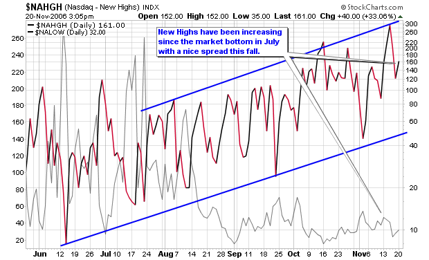
That was the second strongest week of the year with an average ratio of 540-75, just one new high per day less than this past week (new lows averaged 20 less last week than they did during that week in April). Even though the market averaged more than 500 new highs per day, the weakest total came on Friday as new highs dropped considerably as you can see in the table below:

New Highs vs. New Lows – Daily Breakdown, 11/13/06-11/17/06:
Monday showed a ratio of 423-59
Tuesday showed a ratio of 613-71
Wednesday showed a ratio of 756-58
Thursday showed a ratio of 620-40
Friday showed a ratio of 291-46

The accompanying chart shows us the up-trending fashion of new highs on the NASDAQ over the past six months. June and July were very sloppy with mixed results as separation became very clear in mid-August as new highs accelerated their advance while new lows decreased considerably and maintained a low profile.

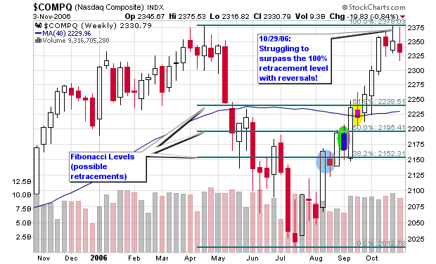
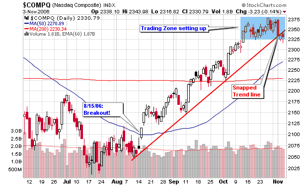
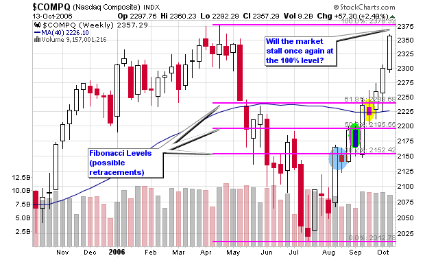
The NASDAQ completed the 100% retracement that I have been following since August here on the blog and has blasted higher on above average volume. As you can see, the index stalled briefly at each retracement level before moving higher and did so in perfect Fibonacci fashion. I am not a complete Fibonacci buff but I do watch for these levels as they seem to apply in longer term weekly charts more often than not.

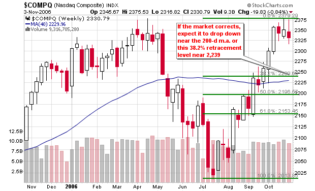
Viewing the daily chart, we can see that the NASDAQ is still trending above the support line that dates back to early August with one slight violation earlier this month. I thought that was the trend reversal but the market quickly proved me wrong and forced me to cover a couple short positions. I also covered a few long positions that actually went higher but I can�t complain because getting out on top is not the objective when trading. Trading the signals and making a profit is my sole objective (picking bottoms and tops are great for blog stories but don�t translate well to portfolios � at least not mine).

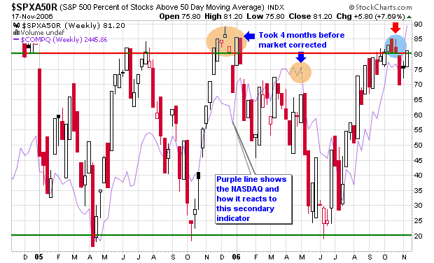
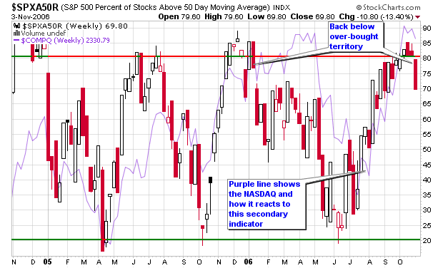
The number of stocks trading above their 50-d moving average in the chart titled $SPXA50R is flirting around the extended area of 80 for the first time since November and December of last year. The lesson we can learn here is the fact that the market didn�t roll over until May of 2006 which means that this secondary indicator is a warning of what may come in the future. I can say this with confidence because the indicator also bottomed a full month in advance of the NASDAQ bottom in July but predicted the move perfectly. Again, this is only a secondary indicator but we are now one month removed from the first peak above the 80% level which could be the start of the warning bells and red flags that the up-trend is winding down. The last topping warning took almost five months to materialize so keep that in mind.

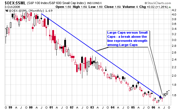
Another of the interesting secondary indicators we have been following on this blog is the relationship between large cap and small cap stocks. Small caps have been beating up larger caps in terms of performance since June 2000 with a few slight down trends from time to time. This was a year where large caps took the lead and were outperforming their smaller cap peers until the past two months. Small caps started to gain strength heading into the election and bounced off of the imaginary trendline on the chart below and have started to catch up in gains with their large cap friends. Many of these smaller cap growth stocks can capture sizable gains in shorter periods of time versus their large cap peers and this is why the overall trend has been higher for the greater part of this century. I wrote about the strength among large caps several times this year but I am firmly invested in smaller cap companies such as the ones listed on the MSW Index.

Some of the recent top performers from the MSW Index are listed below. As you can see from the numbers posted at the end of the day last Friday, the NASDAQ is quickly catching up to the performance of the DOW and S&P 500 in 2006. The NASDAQ was once down about 10% for the year and is now up over 10% and only 5% behind the DOW. How quickly things can change.

Where do the Major Indexes stand in 2006?
NASDAQ: +10.91%
DOW: +15.16%
NYSE: +14.74%
S&P 500: +12.25%

Top Performing MSW Index Stocks last week:
ICE: 18.90%
LRCX: 8.46%
ISE: 5.09%
LVS: 3.91%
JLL: 3.39%
GILD: 3.10%
AB: 2.28%

Here are the total gains of the current crop of MSW Longs:
LRCX: 19.88%, since 9/30/06
BLKB: 34.52%, since 8/5/06
LVS: 59.99%, since 4/1/06
GILD: 11.12%, since 7/29/06
ICE: 37.33%, since 9/23/06
EZPW: 29.39%, since 6/24/06
AB: 16.23%, since 7/29/06
ISE: 17.31%, since 8/19/06
JLL: 9.29%, since 9/9/06
NEU: 32.66%, since 7/29/06
DIOD: -5.75%, since 10/21/06 *currently the only down stock among longs

*11 Stocks (longs) have been cut for slight gains and/or small losses over the past couple of months which gives the index a 56% win-loss ratio in 2006. Twelve short candidates live on the MSW Index with two of them recently covered for losses.

Piranha

Market Snapshot

I will start with the NASDAQ and will focus on the Fibonacci Retracement chart as the Index is having trouble moving through the 100% retracement level. The index has reversed from highs over the past three weeks but did not flash distribution (as a week) this past week. The NASDAQ has flashed four distribution days over the past month which is enough to signal a major market reversal according to CANSLIM rules.


One could also view the weekly chart of the NASDAQ as a deep six month V-shaped pattern with a handle formation. As humans, we can’t argue which chart is correct (the Fibonacci or V—shaped) so we must focus on signals and trade according to those signals. If the market breaks out above the handle, it is telling us to place long positions just as it is giving us the green light to place shorts or buy put options with a continued Fibonacci reversal.

Take a look at the second Fibonacci chart provided which shows where the NASDAQ may reverse if it can’t regain its footing. The logical area would be near the 200-d moving average which is also near the first 38.2% retracement level of 2,239. This same area also serves as the original drop back in May 2006 near the 200-d m.a. Nothing is guaranteed but the signals and setups are there so trade them and cut a loss if you are wrong. It’s not very difficult.


Please remember that Fibonacci retracements are still secondary indicators when compared to price and volume; so don’t make your ultimate decision on a secondary tool. The daily chart of the NASDAQ still shows a trading zone between 2,325 and 2,375 as highlighted in blue on the charts provided. The trend line was snapped as the index is moving sideways with the recent distribution days. Price and volume along with several secondary indicators now point down for the NASDAQ.


The DOW has gained more than 12% over the past four months with an almost straight-up pattern without many breathers. The index reversed from its highs two weeks ago and dropped 0.86% last week on below average volume. The S&P 500 is following the same pattern as it too trades near all-time highs but the weekly down volume continues to come on less than average volume. I have added a Fibonacci graphic on the DOW chart to give you an idea where this tool believes the market will correct. Ironically, the first 38.2% retracement level sits exactly where a handle should have formed before the index moved higher (according to CANSLIM setups).


Other secondary indicators that tell us that the market wants to move lower is the NH-NL ratio which has weakened considerably for the first time in five week as new highs dropped below an average of 300 per day for the first time since late September as new lows have increased to their highest total in a month. We had 688 new highs and only 46 new lows two weeks ago Thursday but had a completely different story told this past Thursday with only 148 new highs and 87 new lows. That’s a 78% decrease in new highs and a 90% increase in new lows. Subtle clues like this can and will paint the picture of what’s going on with the strongest stocks in the market (the leaders). I use the NH-NL ratio as my number one secondary indicator and actually consider it my 1a indicator since it has proven to be so reliable after basic price and volume.


Another indicator is the percentage of stocks trading above their 50-d moving average which spent the past several weeks in overbought territory but has dropped considerably over the past five days (down 13.40% for the week). It took the NASDAQ three months to reverse after this specific indictor gave its signal earlier in the year but the market wasn’t climbing at the extreme angle it is today. It only took the market one month to reverse to the up-side after this indicator gave the over sold indicator in June. Look at the charts page and focus on the light purple line that is plotted behind the chart to see when the NASDAQ was making its move up and down in 2006.


Crude oil is still trading in the range highlighted on the weekly chart and is actually showing more weakness but I have been saying that the elections would probably hold the price down. Gold broke out successfully above the triangular formation that I highlighted last month on the weekly chart and was up over 4.5% for the week as it is trading back at its highest level in two months.


Piranha

Calling the NASDAQ Bottom

I‘ve had a question through e-mail about my Fibonacci retracement charts and how they were late to calling the bottom of the NASDAQ market. That is fine because I don’t need to spot the “exact” bottom of a market, I just need to spot the reversal and hop on. Those of you that follow MSW and this blog on a weekly basis do know that one of my strongest talents is nailing market reversals when they happen because it’s something I have done for years while investing in strong, young growth stocks.

So, I invite everyone to visit this post titled: Déjà vu on the NASDAQ? posted up on Wednesday, July 26, 2006 and determine for yourself if I did see the bottom developing.

Here is some of the text from that blog entry and the chart I posted almost three months ago (July 26, 2006) and an updated chart from my annotated stockcharts file:

7/26/06: “As I was researching my archives on MSW (the archives from 2004 and 2005 are open to everyone) I found some interesting data that correlates the NASDAQ in 2004 and 2006. So far in 2006, we have had 15 down weeks and 14 up weeks. At this time in 2004, we had 19 down weeks and 10 up weeks and the NASDAQ was at a nine month low (very similar to now as we are near 10 month lows). In 2004, my daily and weekly screens started to turn south on May 9th; in 2006, they started to turn south on May 15th (about the same time).

If you look at the two charts presented in this blog entry, you will notice how the market started to weaken in May and June and with a bottom near the end of July into early August. This summer is not over but I am wondering if the pattern will turn out to be similar to the one from 2004. The old saying: “sell in May and go away” has held up over the past couple of year with opportunities resenting themselves during the fall (towards the end of October).

Several of things I was saying back in 2004 are very similar to what I have been saying over the past two months. The similarities are amazing and the current NASDAQ chart may be forming a pattern that could take a similar route as it did in August of 2004. Only time will tell but history repeats and traders are always learning from history.

NOTE: when I say history repeats; I am not saying that it repeats exactly but the charts do resemble similar formations and seasoned traders and investors can capitalize on these situations.”

Click the link for the rest of the post! Déjà vu on the NASDAQ?
Piranha

NASDAQ followed the Fibonacci Levels

While doing my research this week, I really highlighted how the NASDAQ weekly chart has briefly stalled for one week at each of the three Fibonacci retracement levels. I have been covering the chart since mid-August here on the blog as the index has continued to push higher and stall briefly at the 38.2%, 50.0% and 61.8% levels. With the next recognizable level at 100%, the index has moved higher for three consecutive weeks without a stall.

Is this coincidence or is this human nature in action?

I have highlighted the three brief resistance weeks in color while the NASDAQ regrouped before moving higher. It’s an interesting chart that shows how the market corrected at each level on lower volume than the previous week which gave us a clue that the NASDAQ wanted to move higher.

Let’s wait and see what will happen when it reaches the 100% level. Will this be the final push higher and the first major signal of a market reversal?

I covered the chart on the blog in these posts as it materialized in real-time:

8/16/06:
NASDAQ looking for Retracements

8/17/06:
NASDAQ creating Trading Opportunities

8/24/06:
Using Fibonacci Retracements

8/31/06:
Current Market Temperature

9/15/06:
Weekly Market Review

10/04/06:
Talking Heads at it Again!

Piranha

Talking Heads at it Again!

As we all know the DOW set a new record close by finishing at 11,727.34, surpassing the prior closing high of 11,722.98 set back on January 14, 2000. The index was up 0.5% or 56 points as crude oil fell to a 14-month low based on assumptions that lower energy prices may boost consumer spending and hold off an economic slowdown. The NASDAQ was up 0.3% to close at 2,243.65 as it is still miles away from all time high that was set back in 2000 at 5,132.50. The S&P 500 closed at 1,334.11, up 0.2%, as it is within a short distance of its all-time high of 1,553.11.

With all of the excitement surrounding the new closing high, I would like to focus on what the “Talking Heads” are saying. What is a talking head? Please see a post I wrote years ago titled: Ignore “Talking Heads” because they are usually wrong!

Here are some quotes from talking heads today:

  • “Now that you have a definitive new all time high, the fact that it is the Dow and the most recognized index, that is the type of thing that will shine the spotlight on the market,” said Charles Carlson, who oversees $105 million at Horizon Investment Services LLC in Hammond, Indiana, and who wrote “Winning With the Dow’s Losers,” published in 2004. “This could get people interested in stocks.”

Read that last quote! “This could get people interested in stocks”. The only people that get interested at this point in time is dumb money! When “people” such as your mother-in-law, the barber and the taxi driver start talking about the DOW and its all-time high; it’s probably time to get ready for a huge blow-out where smart money takes advantage of dumb money and laughs all the way to the bank. Be careful out there because the wheels will fall off when “people” get interested in stocks.

Another ‘talking head” on a major financial site:

  • “Investors are concluding that the economy is in for a soft landing,” said Hugh Johnson, chairman of Johnson Illington Advisors. “They expect the good news about the decline in oil prices to offset the negative impact of a deteriorating housing market.”
  • “What’s most interesting”, Davidson said, “is not that the Dow has broken through to a new record, but that it has taken the market this long to get to a point at which stocks seem to be fairly valued relative to earnings expectations.”

Who cares, analysts were saying Enron was a buy and fairly valued at $60 before its infamous decline. By the way, talking heads recommended Enron all the way to $12 per share from $60.

  • Scott Wren, senior equity strategist at AG Edwards was cautious about the importance of the Dow’s milestone. “It’s probably of more significance to the retail investment community than it is to the professionals,” he said.
  • “But I do think its a psychological plus and one that could spark some interest and maybe bring a little bit of sideline money into the market.”

From MSW Money:
Twenty-three of 30 stocks in the Dow were higher on the day along with 304 S&P 500 stocks.

  • The rally is a reflection of investor “belief in the sustainability of growth,” Maury Harris of UBS Securities told CNBC’s “Power Lunch.” While the economy may be slowing, it will be a modest pullback at worst, he said. And, added Peter Hooper of Deutsche Bank Securities, investors believe the Fed won’t be cutting interest rates but will step in to support the economy.

When I hear things like this, I start to lick my chops and get ready to short the hell out of the market. These talking heads don’t know what is going on and continue to pump a market and economy that is extremely extended and due for a pull-back. I really don’t know when that correction will start but it will and I am jumping on at the first signal. To be honest, it could take, three days, three weeks or even three months – I don’t know but when it does happen, I put my cash to use!

As many traders have noted, such as Trader Mike, the $SOX or semiconductor index is performing poorly which usually casts some foreshadowing of what’s to come. In addition to the $SOX acting poorly, small caps and other bull market leaders are not stepping to the plate to propel the indexes higher. The NH-NL ratio is weak and is not participating in this rally run and that sends the largest red flag in my opinion. Without the support of small cap growth stocks, you wouldn’t expect this rally to continue. I have been bearish on the Ticker Sense Blogger Sentiment Poll for the past four weeks as the market has moved higher and remain that way.

Some sectors acting poorly on Tuesday were energy stocks, computer hardware and gold stocks. Sectors moving higher Tuesday included airlines (they typically move higher when oil stocks move lower), brokers and some medicals.

Marvel Technology (MRVL) led the semiconductor group lower as it gapped-down and closed with a 12% loss on the largest daily volume in months. The stock is back below its 50-d moving average and is well below its 200-d moving average. The proper CANSLIM short should have come when the stock failed to recover the 200-d m.a. back in mid-June. Similar to the stocks listed on last night’s MSW screen, MRVL can be a poster stock for what to look for in possible shorts.

I have included some charts of the major indexes which shows why I am looking for a pullback and why my screens are focusing on potential shorts.
Piranha