Stock of the Day – Update
Rochester Medical (ROCM)
Monday’s Closing Price: ROCM – $14.75
Potential Trade Set-up:
Ideal Entry: NOW (currently $14.75)
Risk is set at 1.0% maximum of total portfolio or $1,000 of $100k
Stop Loss is 5% or $14.01
Number of Shares: 1,356
Position Size is $20,000
Risk is $0.74
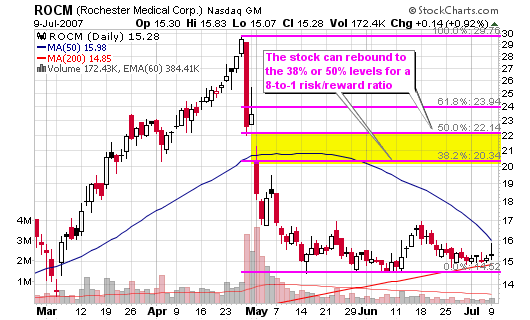
Target is $21
Risk-to-Reward is 8-to-1
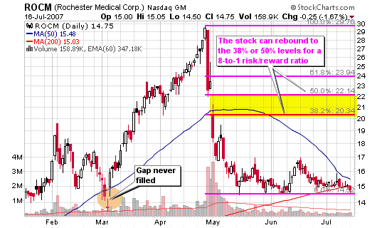
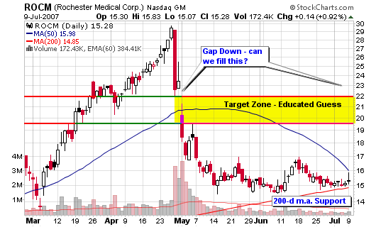
I am providing this potential trade update with the latest trade setup that allows the previous gap-up to be considered (pointed out by a reader: dankkir, “nobody here mentions the gap at 14.19 which needs to get closed before any long term upside…its just another 5% away“). The entire trade has the potential to fall apart if the overall market starts to tank so be ready to cut losses. However, don’t anticipate anything; follow your rules and the trade parameters.
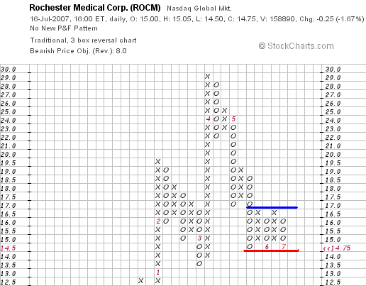
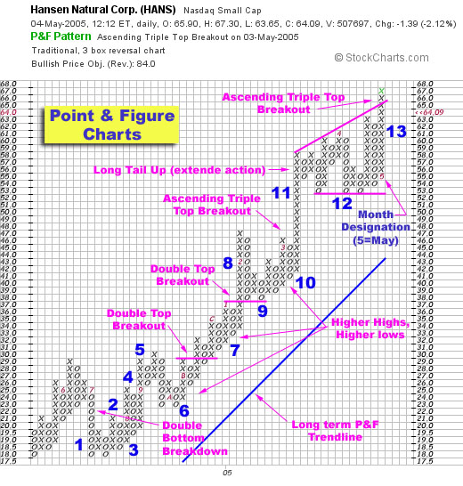
Take a long look at the support and resistance line on the point and figure chart provided. It tells me that the stock is going to blast higher for a triple top breakout or get slammed lower for triple bottom breakdown.
Too bad we can’t play options here (not offered) because I would trade a move and wouldn’t care what direction it went in, as long as it moved. As Taylor says: “Looks like it’s about to fall off a cliff to me.” If that were the case, a straddle would work.
I would create a straddle – remember; I am not a great option’s trader so don’t listen to what I am saying as I am still learning (please chime in if you see a better strategy using options if they were available in this case)!
Long Straddles (definition from optionsXpress):
Have you ever had the feeling that a stock was about to make a big move, but you weren’t sure which way? For stockholders, this is exactly the kind of scenario that creates ulcers. For option traders, these feelings in the stomach are the butterflies of opportunity. By simultaneously buying the same number of puts and calls at the current stock price, option traders can capitalize on large moves in either direction.
Here’s how this works. Let’s imagine a stock is trading around $80 per share. To prepare for a big move in either direction, you would buy both the 80 calls and the 80 puts. If the stock drops to $50 by expiration, the puts will be worth $30 and the calls will be worth $0. If the stock gaps up to $110, the calls will be worth $30 and the puts will be worth $0.
The greatest risk in this case is that the stock remains at $80 where both options expire worthless.


Connect with Me