A Natural Correction or Top?

On May 24, 2007, I wrote an article titled: Are We Nearing a Top

In that article, I said:
“I am not sure if this WSJ article will signal a top but I tend to agree with Barry that this type of front page coverage has a history of signaling things to come.”

“…keep an eye on this performance chart to make sure the up-trend doesn’t extend too far without a natural pullback”

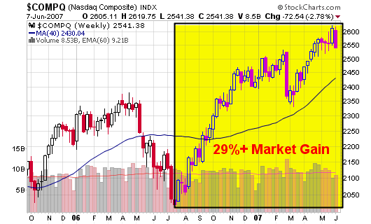
“The second chart shows the NASDAQ reaching a 28% gain over a year ago which has signaled tops in the past. Eugene D. Brody, from Oppenheimer Capital, was quoted as saying: “Sell stocks whenever the market is 30% higher over a year ago”.”

So, what can we make of the market over the past several days?

  • First, the market looks to be making a natural intermediate correction which has been overdue in my personal opinion (remember, the action in the market is only a belief in your own mind).
  • Second, the markets are extended (up 25%+) when compared to their levels from last year and I have been highlighting this fact over the past several weeks. Corrections are due when markets move up by 30% over their levels from the prior year.
  • Finally, the markets can’t continue to trade too far above their 50-d and 200-d moving averages without making a pullback, even if it only last a few days to a couple weeks. They can continue to trend higher but pullbacks are a must in order to achieve sustainability. Welcome pullbacks and add shares in ideal situations.

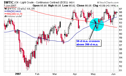
If you follow my annotated charts over on stockcharts.com, you may have noticed the fact that the 50-day moving average for crude oil has recently crossed above the longer term 200-day moving average (a sign that oil prices may push higher). The 200-d moving average is still facing south but things are starting to look better which usually means that stocks “as a whole” may be poised to take a breather or actually trade lower.

060707_crude_daily.png

Let’s take a look at several charts:

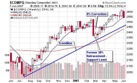
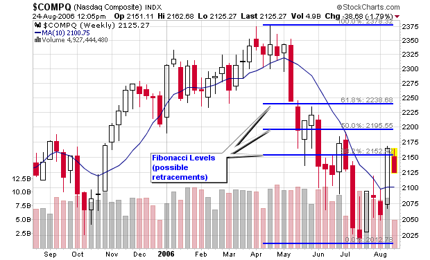
The NASDAQ is now trading a few points above its 50-d moving average and has not traded below this line since its last correction in late February 2007. That correction was short lived but did give back 8% in gains as this week’s losses have totaled less than half of that.

060707_nas_wkly.png

060707_nas_daily.png

060707_nas_29per.png

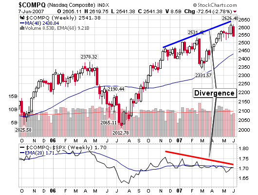
I did miss one BIG signal that highlighted a weak market over the past several months: a bearish divergence between the NASDAQ and its relative strength versus the S&P 500. As the index moved higher, the relative strength drifted lower; not a very promising occurrence.

060707_nas_div.png

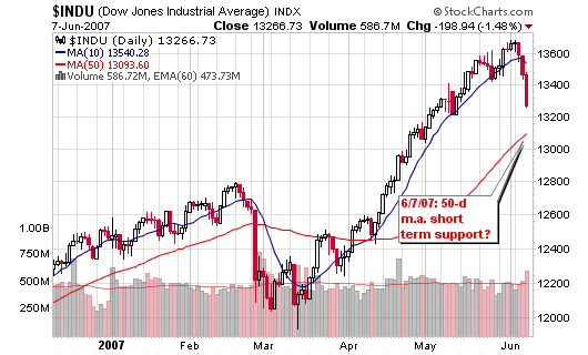
The DOW was down about 3% for the week on above average volume which gives us pure distribution. Looking at the point and figure chart, I see one support level near 13,200 and then a possible free-fall towards 12,800 or 12,750 when overlaying the weekly candlesticks. The 200-day moving average sits near 12,400, an area I would rather not visit at this time.

060707_dow_daily.png

060707_dow_pnf.png

Do I think the up-trend is over?
It doesn’t really matter what I think when you can follow the indicators above. However, I’ll give you my beliefs: The up-trend is making a natural correction and Wall Street analysts and newspapers are freaking. Corrections such as this are welcomed as they allow investors to accumulate shares in the top candidates before they resume their runs.

Annotated Stock Charts

All stocks, case studies and general market analysis that appear on this blog are entered into my public list of annotated charts over at Stockcharts.com. I update the annotations from week to week and sometimes from day to day for specific stocks. The list currently contains 83 real time charts with stocks I own, stocks I am researching, stocks I watch, stocks I have sold and stocks that interest me. It also contains charts for the major market indexes, commodity comparisons, currency comparisons, ticks, oil, gold, highs, lows, etc…


The best part is that these charts contain market data that is updated every 15 minutes from the stockcharts database or content provider. As the market data feeds into the charts, my annotations move along with time and clearly show how well the analysis is panning out (or poorly in some cases).

Feel free to visit my public stock charts list and definitely vote for it if you enjoy the work I am doing. I don’t get anything for the vote except maybe a smile for work well done!


Analyze my Calpine Trade

As I mentioned last week – I sold my shares in Calpine after the candlestick reversal on the 24th. I was more concerned with my buy in BIDU so I never had the time to write a full post about Calpine (CPNLQ) but I did make sure I mentioned that I sold my shares in that post:

BIDU buy up 30% in two Days

4/26/07: “I sold my shares in Calpine but that may have been premature (190% gain). I will buy back into Calpine if it corrects and will let you know.”

050107_cpnlq.png

The stock is getting slammed the past two days and actually reached an early intraday low of $2.95, almost a full $1 lower than my sell of $3.82 and far from the 52-week high of $4.15 made on the reversal last Tuesday. The reversal made my decision to sell on the candlestick charts!

It was an excellent trade, my best trade of the year, especially considering it was a piece of crap stock and trades below $10 per share (not my territory).

The chart shows where I bought, held and then sold – all based on technical analysis!

Using Fibonacci Retracements

I was asked this question in my recent comments after posting a NASDAQ chart with Fibonacci retracement levels:

“How do you find the fibonacci levels of a stock? Is it part of your screening tools or?

I ask as i’ve never tried to implement fibonacci analysis in my swing/day trades, however of late since i’ve been following your blog, you seem to talk quite a bit about it”

I answered the question with a quick link to a Fibonacci calculator I use and then realized that I don’t have a blog entry for understanding Fibonacci numbers. So instead of rewriting what has already been done, I have decided to point you all to a great blog entry titled How to Use Fibonacci Retracements To Trade Stocks by Craig over at the Swing Trading Guide or better know as the Taz Trader Blog

I use Fibonacci retracements for longer term outlooks for major indexes but sometimes use them for individual stocks that may be catching solid support along the 200-d moving average. The most important thing to know is that it is only a secondary indicator in my arsenal, not a front line tool.

If you look at the attached NASDAQ chart, you can see how the index has stalled near the first retracement level as I indicated last week prior to the advance. I suggested a brief consolidation before the NASDAQ looks to move towards the 50% retracement level near 2,195.

By the way, Stockcharts.com has a built-in Fibonacci tool that allows me to draw the levels within seconds. A great tool for their annotated charts!

Piranha

Discovering the TICKS

I was reading through Trader Mike’s blog Wednesday night and came across a very interesting indicator that can be studied on a chart. In his post, Review of “Mastering the Trade” by John Carter, I was reminded about an indicator I have seen on several occasions but have never taken the time to research because I am not a day trader (yet).

Before going further; have you ever been in a situation where you see or hear something once but pay no attention, see it a second time and possibly take a deeper look but then see it a third time and really jump into the concept. I first heard about the indicator TICK or $TICK on stockcharts.com when reading through SFO magazine. I don’t remember the author’s name but I will assume it was John Carter and will take a look later this morning as I save every edition of SFO. The second time I saw TICK was during my 4th of July vacation while reading Martin Schwartz’s Pit Bull as he explained how the indicator is a must for his system. Schwartz said exactly what John Carter’s article states about the levels of TICK so I must assume that many great traders use this indicator. Wednesday was the third time I came across this indicator and the second time in one month so it must be something that my subconscious wants me to look into further (yes, I believe in the subconscious and the idea that the proper tools are presented to a student when they are ready for them). I hope that doesn’t scare anyone away but read Napoleon Hill or watch The Secret and you will understand where I am coming from.

What is a TICK?
The TICKS ($TICK for NYSE or $TICKQ for NASDAQ) summarize the number of stocks on the NYSE that are increasing in price versus those that are decreasing in price from the previous price quote.

Anyway, after reading the blog post and then re-reading John Carter’s article, I started to play with the chart and overlay market information. What was really interesting was the $TICKQ which represents the NASDAQ and how it predicted the top in the market today. While doing my research tonight, I realized that the NASDAQ peaked just before noon (approximately 11:45am) and then headed down for the day. This happened at the exact same time that the $TICKQ reached an intraday high above +800 and then reversed during the 5-minute candlestick. The actual candlestick closed below +600 for the timeframe and then quickly dropped by 50% over the next five minutes which should have told day traders that the market was turning down with heavy selling pressure.

Looking at the chart posted in the blog entry, you can see how the purple line (representing the price of the NASDAQ) topped at the peak of the $TICKQ and then went south for the remainder of the afternoon. The indicator attempted to cross above +500 a few times during the afternoon but was quickly turned sideways or in the opposite direction, confirming the weakness and selling pressure. By 2:30, the indicator was staring to violate -600 and the NASDAQ was reaching intraday lows as most stocks were starting to turn from green to red on my computer screen.

I admit that I don’t know much about this indicator and only started to research it today but I can already see its power and understand how it may help me with my current and future trading systems. I understand charts and this chart was amazingly accurate today so it has caught my interest. I was already interested when great traders such as Martin Schwartz consider it a must and then it is confirmed by John Carter in SFO and then one of my favorite stock bloggers in Trader Mike. I read about indicators and oscillators every day but I toss most of them aside because they have no value to me at this time with my current trading style but I knew within minutes of studying my charts today that this indicator will be added to my arsenal. As I continue to study the indicator and eventually use it with my trading, I will report back on this blog if it has helped or hindered or has done nothing at all.

Piranha