Indicators and Research Save me Money

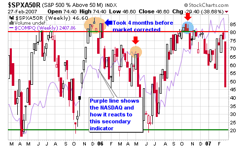
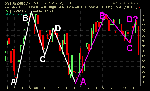
I often write about secondary indicators when watching the market and posted a chart to my MSW community members last week highlighting a pattern for the number of stocks trading above their 50-day moving averages on the S&P 500. This chart shows how the market may be ready to roll over as it did in April of 2006. See my original blog entry on this possibility back in November 2006 named:
Secondary Indicators telling Stories

022807_snp_50d_wht.png

This is what I said in November when writing about the possibility of a market reversal:

“The number of stocks trading above their 50-d moving average in the chart titled $SPXA50R is flirting around the extended area of 80 for the first time since November and December of last year. The lesson we can learn here is the fact that the market didn’t roll over until May of 2006 which means that this secondary indicator is a warning of what may come in the future. I can say this with confidence because the indicator also bottomed a full month in advance of the NASDAQ bottom in July but predicted the move perfectly. Again, this is only a secondary indicator but we are now one month removed from the first peak above the 80% level which could be the start of the warning bells and red flags that the up-trend is winding down. The last topping warning took almost five months to materialize so keep that in mind.”

The last breakdown took slightly longer than four months to materialize according to this secondary indictor. Well, the current pattern is now in the fourth month. Is this coincidence? I don’t know but many secondary indicators have been lining up, calling for a possible reversal.

022807_snp_50d_blk.png

After writing my general market update thread on Monday which stemmed from my in-depth analysis for MSW members over the weekend, I decided to write this on the MSW Daily Screen Monday night after performing my research (2/26/07):

“I am only listing ticker symbols with brief analysis tonight because the market is looking weak. I ran multiple fundamental scans that turned up about 170 stocks but after doing technical analysis, I could barely come up with ten ideal stocks. Take this as another signal that the market may be near a top. I will stress once again that the trend is still higher but some minor flags are starting to creep into my research. This will be an interesting week to watch as I look to close another existing position now that it has hit its target and scan for new opportunities. I will not hesitate to short stocks in the portfolio if a trend reversal becomes obvious.”

Talk about multiple clues from my basic system of research. Now I just hope that most of my members took advantage of the information I have been writing over the past several trading days. We can’t do anything about yesterday as I was also caught on the long side of a couple positions but I did sell out of a position Friday and on Monday in real time in the MSW Portfolio. I send a real-time text message to all MSW members when I buy and sell into the portfolio. I saved the portfolio $4,000 in profits from my sales on Friday and Monday (GRMN and SLW). I still managed to give back several thousand dollars yesterday but the damage was much less because I was already getting sell signals going back to last week.

I finished my daily screen on Monday night with these words:

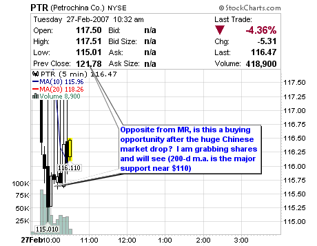
“I have been closing positions as they meet targets because the market is extended when viewing historical terms. I want my profits now before the market can get a chance to drop heavily one of these days. Don’t let this talk scare you because the overall trend is still higher and I will not hesitate to buy high quality stocks such as a PTR after the strength today.”

022807_nasdaq.png

I am patting myself on the back because experience and nothing else made me sell and I am extremely happy. I am finally listening to my research, system and rules and not my gut and it is paying off!

Our First Red Flag

Wow,
I didn’t know the first signal (red flag) would come only one day after making this general market update.

022707_red_flag.jpg

“…we must be on the lookout for a signal or a combination of signals and red flags that could lead to a correction or downtrend. I am long the market but I am always aware of market cycles and I will be watching for signals so I am not telling anyone to sell at this time but I am warning all investors to be smart and listen to history.”

Look at the two charts provided, both of Chinese companies. MR is a great example of why I don’t set hard sell stops into opening bells.

022707_mr_daily.png

PTR is also an example of how I can take advantage of a possible market overreaction for a stock I still like long term. The risk to reward is great so I am grabbing shares. If it doesn’t work out – I will sell for a small loss.

022707_ptr_daily.png

Red flag number 1 has arrived!

022707_red_flag_days.jpg

General Market Update

I used a quote for my weekly MSW analysis from a fund manger from Oppenheimer Capital named Eugene D. Brody: “Sell stocks whenever the market is 30% higher over a year ago”.

The NASDAQ is currently 25% higher than it was in July 2006 and is trading in new high territory (the highest level in six years). Historically, markets retreat after making a 30% gain from one year to another and we must be on the lookout for a signal or a combination of signals and red flags that could lead to a correction or downtrend. I am long the market but I am always aware of market cycles and I will be watching for signals so I am not telling anyone to sell at this time but I am warning all investors to be smart and listen to history.

022607_nasdaq_weekly_sm.png

Like the NASDAQ, both the DOW and S&P 500 have made considerable gains from their lows in 2006. They are both up about 20% and have been riding their 50-day moving averages for the past seven months. The first possible red flag of a trend breakdown would be a major violation of the 50-d moving average among one or all three major indexes. The second major red flag could be the breakdown of the relative strength rating for the DOW or NASDAQ versus the S&P 500. I have highlighted the RS line on the DOW chart with the bottom representing a possible trend reversal and the top of the shaded area representing another leg of the up-trend (a fresh breakout to new all-time highs).

022607_dow_weekly_sm.png

When reading the 2007 Stock Trader’s Almanac, I see that March represents the fifth best month of market gains over the past 100 years but has been volatile in the latest decade with large gains and losses. March has had a gain for the past eleven straight pre-election years and that is exactly what we are in right now. Take this with a gain of salt because price and volume is still the most important. The markets also haven’t experienced a down year during a pre-election year over the past 68 years. There hasn’t been a down year in the third year of a presidential term since 1939 (World War Two era). The only severe loss during a pre-election year was in 1931 (the depression) when looking at data than spans to the early 1900’s. During Bush’s last term, the market was 25%, 26% and 50% for the DOW, S&P 500 and NASDAQ respectively. This did happen during the fall of Saddam with the beginning of the Iraq war.

022607_snp_weekly_sm.png

We haven’t had a stretch of strength for the NH-NL ratio as we have witnessed over the past four weeks since 2004 (almost three full years). We have not had three consecutive weeks of new highs averaging 500 or more new highs since 2004 and we didn’t have three out of four weeks with these types of numbers in 2005 or 2006. We had our second best week since December of last year with new highs averaging 556 per day and new lows only reaching an average of 42. I must point out that this was a short week due to the President’s day holiday but the strength must be noted. It was the third time this month that the weekly highs averaged more than 500 per day. February of 2007 has been the strongest month for the NH-NL ratio since early 2004. Is this a sign of things to come or is this a topping signal? I read it as a trend and the trend is higher and until that is violated, we stay long!

022607_nh-nl_ratio_sm.png

Weekly New High – New Low Ratio (NH-NL) for 2007:
Saturday, January 6, 2007: 279-67
Saturday, January 13, 2007: 344-39
Saturday, January 13, 2007: 281-46
Saturday, January 27, 2007: 316-55
Saturday, February 3, 2007: 502-45
Saturday, February 10, 2007: 558-53
Saturday, February 17, 2007: 428-48
Saturday, February 24, 2007: 556-42 – This past week (a short week)

Must Read Stock Market Blogs

I wrote a post late last year highlighting my Top 10 Financial Blogs on the web.

I must say that my list has grown to about 25 excellent blogs that I visit on a daily and/or weekly basis. I no longer consider it a “top 10” list or a “top” list at all because every blog in my blogroll is better than most in my opinion. I am sure I am missing or have not found some of the best stock market blogs on the web but I will in the future and will add them as must reads where warranted. Until that time comes, here are the newest additions to my daily must reads!

022307_best.bmp

Trading Goddess
A great daily stock market blog with even better pictures!

Bill Rempel, a.k.a NO DooDahs
Some of the best stock market insight on the web.

WallStreetFighter
Come here for a laugh and some great pictures and links.

HighChartPatterns
A similar trading style to me with emphasis on charts.

Random Roger’s Big Picture
Nice insight into foreign markets and ETF’s

Value Blog Review
Want a review of a market blog or book – come here!

Digital Breakfast
Investing in stocks and Real Estate (I have been following his foreclosure posts)

Stock Trading 101
The official blog of the Falkin Investing Organization run by Blain

Stock Market at Stockforlife
Daily updates on personal trades in the market.

Stockbee
A CANSLIM approach to trading.

Alpha Trends
Excellent video blog of the market

Have a great weekend and don’t forget to take a look at my original list – all still excellent blogs to visit on a daily basis!

Mr. Mindray on the Move

Mindray Medical (MR) is up almost 6% today on volume about 300% larger than the average as it trades near new all-time highs.

022207_mr_daily_sm.png

The stock was highlighted a couple weeks back in a post titled China’s Mindray Medical Intl. (MR).

This is what I was thinking when I wrote the analysis:

What catches my eye the most about this stock is the number of shares bought and sold during the most recent reporting period! The buy to sell ratio is 39-to-1 which represents institutional accumulation in my opinion and I get warm and fuzzy when these professional buyers support a stock I own (disclosure: I do own shares prior to writing this post). The amount of fundamental data is limited on the young Chinese company but I have listed what I can find using a variety of sources (Yahoo giving me the most data).

Looking at the chart, we can see that the stock is gaining support along the 50-day moving average and is within 15% of a new all-time high (set back in December 2006 at $27.20). The weekly chart shows a flat base that has been forming over the past seven weeks with potential for an up-side breakout. A 200-d m.a. has not formed at this point in time but will be valuable in the future. Overall, I like this young stock and I like the market it comes from.

022207_mr_weekly_sm.png

Yes I do own shares and this is why:

Institutional Numbers:
Money Market: 21
Mutual Fund: 75
Other: 4

Shares Bought Last Period: 6.4 million
Shares Sold Last Period: 0.2 million
Value of Shares Bought: $156.4 million
Value of Shares Sold: $4.9 million