Sour Apple?

Apple $AAPL is up more than 4,300% since March 2003, the beginning of the bull market following the stock market bubble burst (post 9-11). The stock is up slightly more than 1,200% since I started covering it online (my blogger blog which pre-dates the blog you are reading).

I have owned APPL on multiple occasions over the past 6 years but I wish I could sit here and write to you that I was a holder the entire time (my gains are just a small slice of the longer term buy and hold pie) . I wasn’t a 1,200%+ gainer but I was in and out while taking profits on a yearly basis back in the mid to late 2000’s. Below is an example of yearly posts I made about Apple or as I called it “Green Apples” due to the fact that it was a cash register stock.

So, with all that praise and the massive gains, am I really turning bearish on the stock? Is Apple starting to turn sour? Well, not so fast but some minor red flags are starting to show up. Take a look at the charts below which highlight the lower highs and lower lows.

January 13, 2005: Green “APPLE”s

“Apple (AAPL) first showed up on my weekly screens on 10/24/04 at $47.41. Since this time, Apple has made the daily and weekly screens numerous times.”

January 17, 2006: All-Star Stock – Digesting Apple

“Apple has been on my screens for 15 months and has been in my portfolio on two separate occasions over those 15 months.”

January 10, 2007: Apple Inc. is Still Green

“What can I say; the apples keep getting greener!”

November 29, 2007: An iPod touch from Apple (AAPL)

“A new high and a move above $200 per share will be very bullish and a signal that this stock may have another run regardless of what the major indices do.”

Apple is still trading above the 200-d moving average and has not violated any long term trendlines so please do not short at this time. You may cash in shares and start to trim back your position by selling but I don’t advise going short just yet.

The ideal position to sell short is after a move below the 200-d ma when the stock tries to break back above but fails – that’s my sweet spot.

Goldman Sachs set a price target of $430 but I don’t listen to these “talking heads”. Another interesting fact: “Nasdaq OMX plans to announce a rare rebalancing of its Nasdaq-100 index, which will reduce the big weighting of Apple, which currently makes up more than 20% of the index.” – WSJ

As of today, April 11, 2011, I suggest cashing in some shares. A further drop and I suggest selling more shares. I wouldn’t even consider the word “short” until the stocks closes below the 200-d ma (trend trade of course – not day trading).

Let’s see if this decade long “Green Apple” turns into a “Sour Apple”.

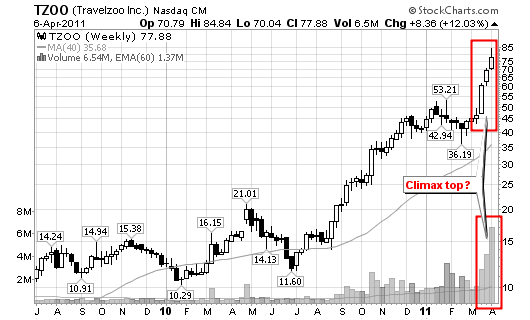
Climax Top in TZOO

How can you tell when a market is exhausted from a long term up-trend?

The current market leaders will start to form climax tops after huge gains over the past 6, 12 or 18+ months.

So, how do we identify a climax top?

The following characteristics are typically found in a stock that is forming a climax top:

  • A quick run-up or accelerating gains over a short period of time after a long term up-trend. The gains will be much larger during this short term run, proportionally, than the entire up-trend.
  • A large gap-up after several months of a steady up-trend. Investor’s Business Daily (IBD) calls this an “exhaustion gap”.
  • The largest daily and/or weekly volume of the entire up-trend.
  • A large single day point gain, the largest of the entire up-trend.
  • An intraday move to new highs on above average volume but a close that results in a loss.
  • A stock that is trading 100% above it’s 200-day moving average. IBD states that a stock trading 70% above its 200-day moving average is showing exhaution.

Take a look at the $TZOO Travelzoo charts (daily and weekly).

As you can see, TZOO has confirmed the following red flags for a climax top formation:

  • 10 of the past 13 days have been up days.
  • A 68% gain over the past 13 trading days and a 100% move over the past month. Stock is up 900%+ since March of 2009.
  • The largest daily and weekly volume of the entire run.
  • A new high intraday with a close that resulted in a loss (today: a new high with a reversal to close down 3.69% on volume 485% larger than the average).
  • The stock is trading more than 130% above its 200-day moving average.

With all that said – what should you do? I suggest that gains are locked in, at least a portion of your position 1/3 or 1/2 at a minimum.

In addition to locking in individual gains (in examples like TZOO), I highly suggest that you start to watch all market leaders and the general market indices for red flags.

Google (GOOG) 1-2-3 Trend Reversal Confirmation

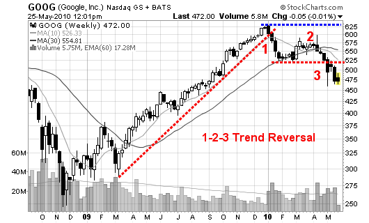
Google (GOOG) has setup the Trader Vic 1-2-3 pattern or a Dow Theory confirmation of a trend change.

052510_GOOG_wkly

As you can see:

  • GOOG broke the up-trend after establishing a new 52-week high above $629 (point #1).
  • From there, it consolidated and formed what is referred to as the minor sell-off (the lower horizontal red dotted line).
  • Prices started to rise but failed to make another new high. This test of the previous high failed near point number 2 (March & April).
  • A failure to make a new high is usually (not always) a signal that the trend is about to change. This is where some traders jump in early.
  • Lastly, we reach point number 3 where prices drop below the previous short term minor sell-off (this is trend reversal and the signal to short). If missed, you can short on the first failure to recover the major moving averages (or #3 area which then turns to resistance).

This is the pattern I am watching setup in dozens of stocks across multiple industries. I am also watching this pattern to potentially setup in the major indices as well.

Remember, have patience and be prepared to sit on the sidelines for a while as this pattern takes time to build and then confirm (4 months for GOOG). The key word is CONFIRMATION!

You may play GOOG up and down short term but long term, the trend has changed!
Follow me on twitter to watch the stocks currently setting up this pattern (prior to confirmation).

Trader Vic 1-2-3 Trend Reversal Pattern

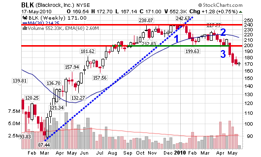
Blackrock (BLK) setup what Trader Vic would term as a 1-2-3 setup or a Dow Theory confirmation of a trend change.

051710_BLK_wkly

As you can see:

  • BLK broke the up-trend after establishing a new 52-week high above $242.
  • From there, it consolidated and formed what is referred to as the minor sell-off.
  • Prices stared to rise but failed to make another new high. This test of the previous high failed near point number 2.
  • A failure to make a new high is usually (not always) a signal that the trend is about to change.
  • Finally, we reach point number 3 where prices went below the previous short term minor sell-off (this is trend reversal and the signal to short). If missed, you can short on the first failure to recover the major moving averages (or #3 area).

In addition to the 1-2-3 setup, the stock has also allowed its 10-week moving average to cross below the 30-week moving average with typically signals a change in trend when both lines are starting to point down.

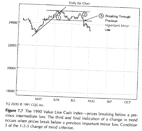
Victor Sperandeo says this about the 1-2-3 setup:

At the point where all three of these events have occurred graphically, there exists the equivalent of a Dow Theory confirmation of a trend change. Either of the first two conditions alone is evidence of a probable change in trend. Two out of three increases the probability of a change in trend. And three out of three defines a change in trend.

Take a look at the picture I scanned from Sperandeo’s book on page 76:

092607_123_book

This is essentially the pattern I am watching for in several of the stocks starting to churn (run out of steam) that I posted to my twitter stream. However, have patience and be prepared to sit on the sidelines for a while as this pattern takes time to build and then confirm (nearly four months for BLK).

Twitter stream for 5/17/10 (stocks down on heavy volume, trading near 30-wk): $PCLN, $GMCR, $V, $MA, $TCK, $BUCY, $BTU, $MR

Recent Tweets on BLK:

  • 7:33 PM Apr 6th via web: $BLK – 198.55, clearly falling apart (but gap down has to fill before ultimate slide).
  • 10:02 PM May 5th via web: $BLK…Trading @ 174.80 & going down!

This is a game of odds with developed expectancies so take the trades and follow the rules.

Calling Tops and Bottoms: Trend Changes

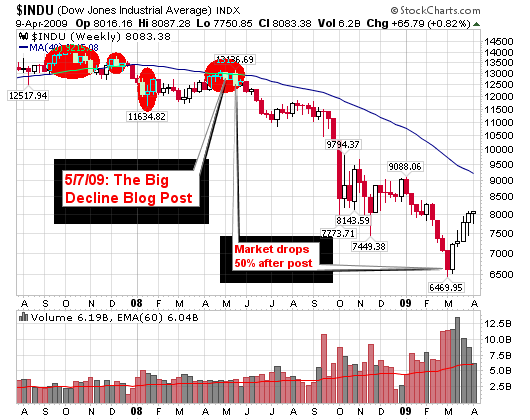
Every once in a while you like to look back and review your notes to locate where your research was right and where it was wrong. The simple technique of following stock market leaders and the NH-NL ratio nailed the period of time when the market transitioned from an up-trend to churning to the “Big Decline”. We nailed it here on this blog and every reader was prepared for the imminent decline. No one can dispute that. Readers of this blog were told to move to cash to preserve capital in late 2007 and early 2008. Now, I am not talking about day traders but longer term traders or investors that work full time and do what I do.

The chart highlights in red where I was making the sell posts (the articles are listed below):
041009_trend_change

Anyway, I have been posting twits about the strengthening of the NH-NL ratio which is starting to tell me that the newest trend change is beginning. Yes, this is my first major blog post saying that my screens (market tools) are telling me to wake up because things are starting to change. It’s not time to jump in with both feet and buy every stock that’s up on above average volume but it’s time to sharpen the skills and be ready. We may look back and point to March and April of 2009 as the bottom of the market or at least the start of the changing trend.

We don’t have market leaders yet but when they appear, I will locate them, post up charts and talk about them nightly on twitter (twitter.com/cperruna). Too many stocks still have their 50-d moving averages below their longer term 200-d moving averages and new highs are still limited. However, new lows have dried up considerably and the NH-NL ratio has a moving average that is trending higher for about a month now. That’s the most sustainable trend for this ratio since the big decline started.

Stay tuned to the blog and my twits for follow-ups to my research on individual stocks and the overall trend.

In the meantime, take a look back at the numerous blog articles I posted in 2007and 2008 talking about a market decline, shorting stocks and selling in general. Learn from what the simple tools were telling us. I am far from a market genius and far from rich but I can make a few dollars following the leaders and the NH-NL ratio.

A Review of Articles Pointing to a Stock Market Decline in early 2008:

  • May 23, 2008: Smelling Trouble

    The bottom line or point of today’s rant is the fact that I still feel that the market is headed for a decline or as I phrased it a couple weeks ago: The Big Decline (long term perspective of course).

  • May 8, 2008: Market Distribution

    I originally started to point out market troubles back on March 14, 2008 in a post titled Snapshot Friday; I highlighted both the Dow Jones and NASDAQ with clear yellow shaded areas showing the 200-day moving averages pointing down for the first time since 2003 (that’s huge if you ask me).

  • May 7, 2008: The Big Decline

    I am a positive person by nature and I prefer to buy stocks going up but I am starting to see several leading stocks struggle to hold new highs or fail to challenge recent highs. These patterns are familiar and they are suggesting that the recent bounce is the final stage before a possible market decline.

  • January 23, 2008: Setups for Selling Stocks Short

    I wrote an article on October 15, 2007 titled How to Make Money Selling Short, precisely when the general market indexes were topping. I am not going to take full credit but subconsciously my charts were giving me signals that the market was showing the major red flags and signals of what we are seeing today.

A Review of Articles Talking about Selling, Profit Taking and Market Distribution in late 2007:

  • 10/03/07: Is Shanghai a Nasdaq Déjà vu

    Well, the current two year rise of the Shanghai Stock Exchange Composite Index looks remarkably similar to the rise of the NASDAQ of the late 1990’s and the charts below explain better than I can!

  • 10/04/07: A Technique for Profit Taking

    What do you do in a market like today when you have profits in multiple positions but you don’t want to give it all back? You want to continue to ride the winners but at the same time, you want to maintain the unrealized gains in your account. HOW?

  • 10/12/07: Distribution Day

    This was the largest showing of volume in two months and is not healthy because it was pure distribution. It was only the second distribution day over the past month so we can’t call this a bear run but please be on the lookout for a possible correction of 5%-10%. Technology stocks led the decline as BIDU gave back 10% of its amazing run.

  • [Read more…]