Do you really want to know how to pick market tops and bottoms? Really?
Well, you don’t need a crystal ball, you don’t need any Wall Street guru’s, you certainly don’t need fancy computer software and you can simply ignore the talking heads. It’s that easy. Maybe we won’t pick absolute tops and bottoms but we can identify trends as they begin to develop.
You just need to follow the action among the individual stocks in the market! Learn to focus on the number of stocks making new highs versus the number of stocks making new lows. It’s been the true crystal ball in my method since I started to turn a consistent profit in 2002. It’s the backbone of my trend following methods.
The NH-NL Differential is simply the number of stocks making new highs minus the number of stocks making new lows.
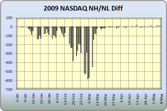
I follow the progress of stocks making new highs and new lows on the NASDAQ and NYSE and pay specific attention to turning points in the differential. I am not so interested in the extreme highs or lows of the ratio but rather changes in trend from positive to negative and negative to positive over a period of time.
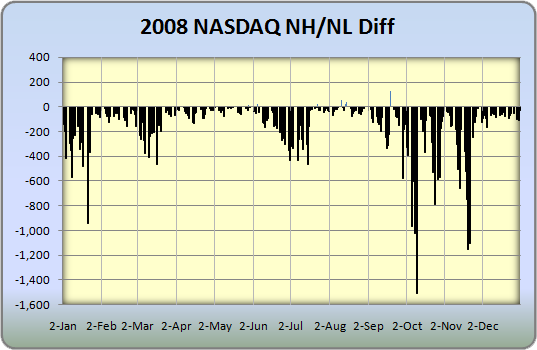
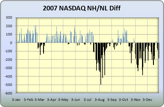
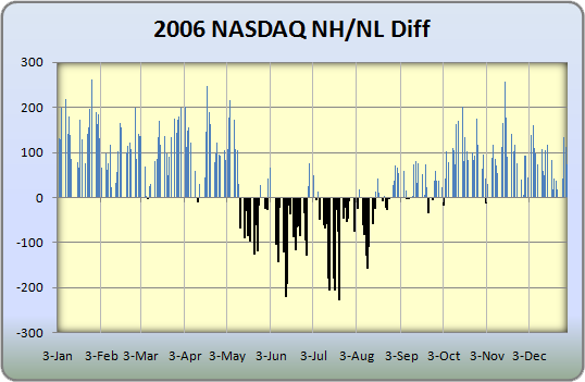
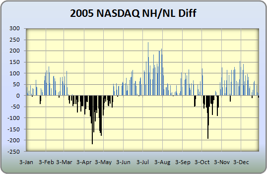
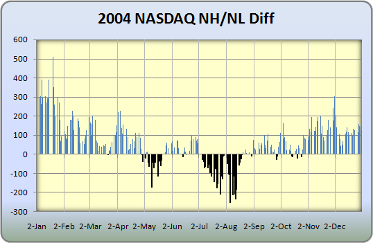
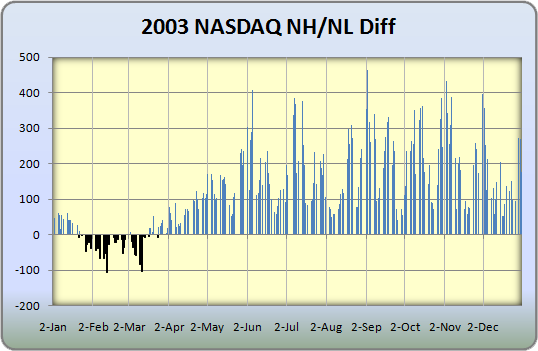
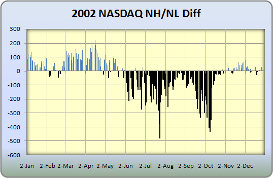
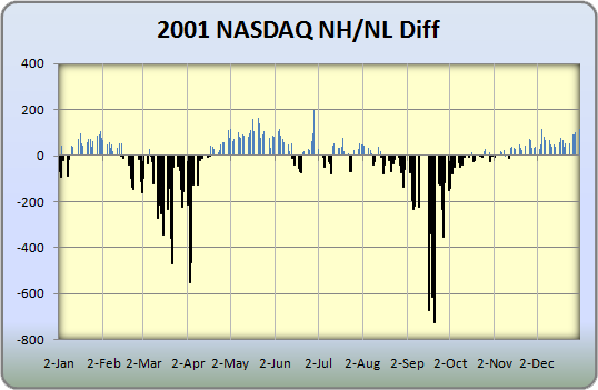
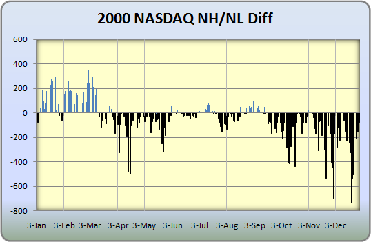
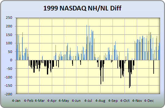
The yearly Nasdaq New Highs and New Lows (Differential) are captured in my charts below, dating back 10 years. With many market pundits (or talking heads) saying that we may have reached a bottom, I felt it was time to do some homework and study the past charts so we know what to look for in 2009. It is true that the trend seems to be changing but we aren’t quite there yet. Focus on 2002 and 2003 to get an idea of what we may see if this market decides to make a true up-trending run, one that’s sustainable.
Consistent Nasdaq readings above 100-200+ will be the official confirmation to grab and add shares for trend traders!


Very nice. And intuitive. Do you have an automated or relatively simple way to construct these charts? Thanks.
Ray,
Simple excel spreadsheet and charts.
Congrats on your new cutie pie. Is there a ticker symbol for this NAS NH/NL differential. TIA Janet
Janet,
Thank you. Sorry, no ticker as I developed these charts myself in excel using historical data.
Chris: Thanks for these charts. Where can I get high/low data and market volume to build my own historical spreadsheet. I am very compelled by NH/NL indicators and watched my uncle double his retirement assets by mastering them!
Very nice. When I compare 2009 to the year that the bull market started in 2003, it’s plain to me that we are not in a bull market, and therefore we must be in a bear market sucker’s rally!
Hi Chris, great work. Do you use 52 wk NH NL or just absolute values?
Thanks,
rB
John,
Pinnacle Data Corp sells historical data systems that will allow you to build spreadsheets and charts.
hanky,
You are 100% correct. Until we get stronger readings, the action doesn’t give us much to talk about.
rB,
52-week highs.
chris, thanks for this NH/NL info that you provide. please continue to post it regularly so we can jump on board when there is a solid confirmation. great work!!
Chris,
Sorry that this was placed under the wrong topic. I wanted to make sure you saw this.
Congratulations on baby Joseph.
May he bring many years of happiness. He’s already helping you out taxwise. He is another exemption 🙂
Matson
Great charts, this is a good visualisation which mutes a lot of the chatter. BUT we have been trading on equilibrium of hi and lo for a few months now. indicision?
Great job Chris. I assume you are using daily readings of the New 52 week highs and lows. Weekly data might provide even clearer picture: weekly readings for the differential between stocks that are within 5% of their 52 week highs and within 5% of their 52 week lows.
Take care!
Would you be willing to post your weekly NH-NL data that you use for your NH-NL Ratio indicator for 2008 and 2009. I searched your site for it and did not see it. You used to post the weekly NH-NL numbers and I can only find them going back to 2007 on your site. I have been reading your site for awhile and followed this indicator but since 2008 have been out of the market and not keeping up on this data.
Chris,
This is a great indicator. I clearly see what you’re saying. Thanks for the idea.
P.S. Short term, looking like we’re headed lower.
Hello Chris !
It would be very interesting to compare the ratio with the number of companies listed on the Nasdaq for each year.
something like :
(NH-NL)/number of companies *100
I can’t find the historical number of companies listed, so If someone could help us it would be nice 🙂
Great Staff Mr Perruna !
Cedric,
I have been looking to track down that information as well so we can compare past years in an apples-to-apples perspective. 200 new highs today may carry a much lower percentage than 200 new highs for the NASDAQ 10 years ago.
I think I may have the data in my advance-decline information (it tallys total listed). I need to check if unchanged stocks are accounted for before I post something up. I’ll let you know what I find.
Excellent point – you read my mind!
There is a good backtest about “ANHL” here:
https://www.optionetics.com/market/articles/11772/print
I think that it’s a good “Green Light” when we get a 2.5% ratio for starting to track and buy sound patterns.
Right now, I’m writting my memory for the end of my business school… I’ve created a “Long Only” pattern in order to manage risk portfolio by market phases for trend following portfolio managers… The ANHL acts as a green light 🙂 I just need more data to test it! Chris this add on to my pattern came from you : thks a lot!
Cedric,
Nice article. I have the data for total issues for the NASDAQ dating back to 1978. I ran the formula in the article you posted and now have the ability to chart the % as noted. We have only had one reading above 2.5% since the start of 2008 (at first glance). 76 such days were above 2.5% in 2007.
Playing further, we can start to apply averages as well to smooth out the line.
I hope to have some data posted this week (with charts).
I think these are great charts, but… I think it is worth considering the magnitude of the drop in October of 2008 when correlation for just about everything was 1. That pretty much guarantees that you won’t start seeing significant upticks in the chart until October of 2009, maybe. So in this particular time period, I don’t think you should interpret the lack of substantial upticks as meaningful. The downticks should continue to be meaningful and useful.
That’s not to say that I think we’re in a new long-term Bull Market or anything, just that in any more normal circumstances there would have been some nice upticks due to the strength, magnitude, and breadth of the recent rally.
I think enough of this that I have incorporated the charting into my spreadsheet, using a line instead of bars, with an overlay of the NYSE composite. I knew that data I’ve been accumulating would be useful!
I’m confused.
Using StockCharts.com I tracked both $NAHL and $NYHL with highs for weekending 5/22 and see vastly different(lower) highs than your 5/20 Tweet showing 69 and 5 respectfully.
Is there a history of data errors from StockChart.com or Pinnacle?
I misspoke in prior comment. I meant to refer to the $NAHL only. StockCharts.com shows a high of about 28 for the week for $NAHL and a high of about 6 for $NTHL.
As I interprete either of the charts there is no apparent upside strenght.
Link: http://stockcharts.com/h-sc/ui?s=$NAHL&p=D&en=&id=p11140236603
Expanding on my previous post, let me predict with 90% probability that we will start seeing enormous upticks in October and November of this year. Will that be meaningful?
I hope so… but the real game is to wait for the first signal of this potential cycle of accumulation in order to be full invested in leaders… Am I wrong Eric W ?
1st October will be the official start of “bull” presidential market cycle
The easiest way to calculate and use the cumulative NH-NL index is to subscribe to TC2000-MutualFund
service. They have named it as indicator T2123. I plot 13Week exponential moving average on weekly chart. Whenever indicator is above the moving average, I stay invested completely, and whenever below, I stay out. It has worked miracles for me. The cost of service about $140 a year. Good luck.