False Markets

I only have a few things to say: the up and down swings of the market over the past few days is an illusion. The prices are not completely true as short sellers have been eliminated from the equation (in the most important area). Do we trade in a free market system? I guess not. Until the short sellers return, the rest is baloney! I wonder if that 777 point drop would have been closer to 1,500 if short sellers were in the market.

Be careful when they do return (as restrictions are lifted).

Keep this in mind: the 777 point drop may have been the largest one day point drop but it was only #17 for total percentage points at 9%. The largest drop ever was 22%.

I am still long the dollar (and believe it or not, shares in Visa). What a mess!

We may have false markets but charts don’t lie!

8/24/08, $76.81: US Dollar Buy Signal

12/17/07, $77.43: US Dollar Snapshot

Titan (TITN) Relative Strength

Stock of the Day – Update
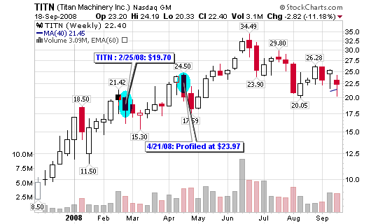
Titan Machinery Inc. (TITN)
Friday’s Closing Price: TITN – $22.40

Titan Machinery Inc., which runs construction and agriculture equipment store,s raised its full-year guidance for revenue and earnings per share earlier this week. Its fiscal second-quarter profit more than doubled as all three of the company’s businesses posted revenue growth. Net income for the three months ended July 31 jumped to $3.3 million from $1.4 million a year earlier and revenue surged to $134.9 million from $85.8 million.

The stock has been holding up rather well despite the weakness in the current market (Thursday aside). Its relative strength rating is within the top 1-2% of all stocks trading and the EPS rating is in the top 1% of all stocks trading. Overall, TITN is a stock that I wouldn’t mind adding shares here at the long term moving average. Disclosure: I do own shares at this time.

Past (TITN) Titan Machinery Inc. Blog Posts

Shanghai is a Nasdaq Déjà vu

“All through time, people have basically acted and re-acted the same way in the market as a result of: greed, fear, ignorance, and hope – that is why the numerical formations and patterns recur on a constant basis” – Jesse Livermore

Jesse Livermore says it better than me and he is a big part of the reason why I study chart patterns so intensely. Stock charts organize human behavior in patterns that allow us to anticipate future moves based on past results. Based on this assumption, I wrote a post last October titled: Is Shanghai a Nasdaq Déjà vu

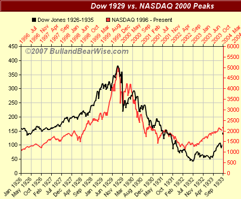
I compared the 1929 Dow Jones to the 2000 NASDAQ (as many have before me) and then the 2000 NASDAQ to the 2007 Shanghai Composite Index. The three looked so eerily similar that I knew I had to write an intense post with excellent graphics to back up the possibilities. The entire post is pasted below or can be found on the link above. This is what I had to say about the future developments of the Shanghai Composite Index based on my studies of 2000 and 1929:

This won’t happen overnight but human nature always repeats so expect a huge decline in the Shanghai Stock Exchange within the next several years.

“The price pattern reminds you that every movement of importance is but a repetition of similar price movements, that just as soon as you familiarize yourself with the actions of the past, you will be able to anticipate and act correctly and profitably upon forthcoming movements” – Jesse Livermore

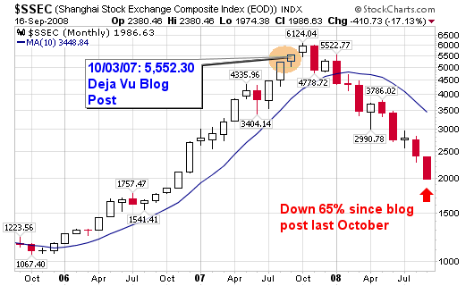
Well, take a look at what has happened to the Shanghai markets since my post last October: The chart has dropped in almost an exact shape and slope as did the NASDAQ in 2001 and 2002. The index is now down more than 65% since my blog post and more than 70% since its peak.


The moral of this post (I’ll leave it to Livermore one last time):
“Wall Street never changes, the pockets change, the stocks change, but Wall Street never changes, because human nature never changes” – Jesse Livermore.

Take a look at the charts from 2007 and compare them to the charts above. Human nature!

*************October 3, 2007 Blog Post*************
The rise of NASDAQ in the late 1990’s has been compared to the rise of the Dow of the late 1920’s. Chart overlays are amazingly similar.

100207_dow_nas.png
Image from BullandBearWise.com

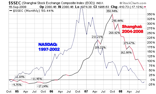
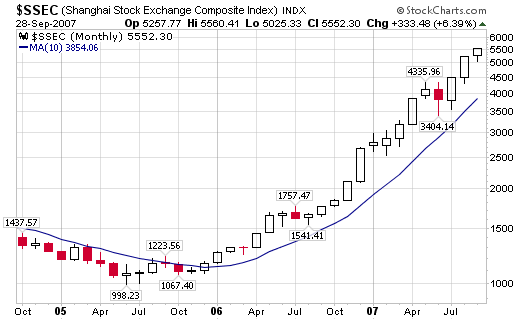
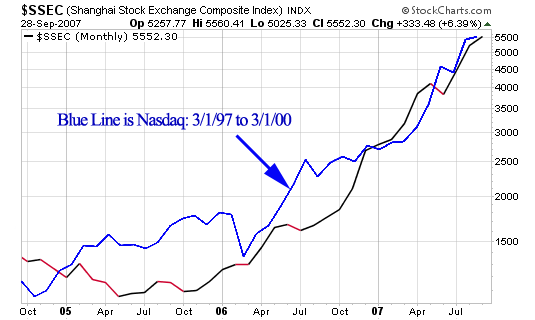
Well, the current two year rise of the Shanghai Stock Exchange Composite Index looks remarkably similar to the rise of the NASDAQ of the late 1990’s and the charts below explain better than I can!

100207_nas_up.png

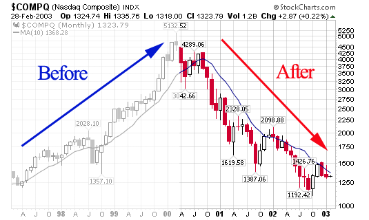
The NASDAQ rose from 1,250 to 5,132 from March 1997 to March 2000: 310% gain!
The Shanghai Stock Exchange has moved from 998.23 in June 2005 to 5,552.30 today (10/2/07): 456% gain!

100207_shanghai.png

As you can see, the blue line of the late 1990’s NASDAQ has moved meticulously with the Shanghai Index of today.

100207_nas_shang.png

Will the Shanghai Stock Exchange end up with the same result as the NASDAQ of the late 1990’s. As you can see, the NASDAQ went from 1,250 to 5,132 back down to 1,192 (all within a five year period).

100207_nas_rise_fall.png

This won’t happen overnight but human nature always repeats so expect a huge decline in the Shanghai Stock Exchange within the next several years.

1929, 1999, 2007, etc…
***************************************

Is Shanghai a Nasdaq Déjà vu

My Stock Trader Interview

Excurse me for my lack of posting over the past month but I assure you that it will pick up as we enter the fall and winter seasons. I completed an interview back in February with Tim Bourquin of Trading Interviews. The interview lasts about 20 minutes covering topics such as how and when I started trading, the types of fundamental screens I use each night and the four of charts I study for each stock I research (daily, weekly, point and figure and intraday).

Have a listen if you haven’t already.

I plan to start rolling out a few of my better education articles mixed in with real time stock analysis in the form of daily screens and case studies, etc. Trust me, the action on this site will pick up again. Call my absence a sabbatical, if you will.

The interview can also be heard on the Trader Interview website or this direct permalink using Windows media, RealPlayer, mp3 stream or direct link to mp3. My favorite place to listen is on my iTouch using iTunes, by subscribing to the free Trader Interviews podcast.

Enjoy and certainly let me know what you think!

Show notes: Chris Perruna is a part-time trader who holds positions from three to nine months at a time, looking for larger moves in stocks he chooses based on the CANSLIM method from Investor’s Business Daily. Here we talk about the three stock screens he uses each night, why he likes stocks that are about to bounce off their 200-day moving average and why he, even though he is a longer-term trader, will get out of a position the same day if the trade isn’t working out. Chris’ blog can be found at: ChrisPerruna.com.

US Dollar Buy Signal

Well, I am fresh off of my Europe trip and ready to study the charts this week. I’ll start by posting a few charts of the US dollar. I have talked about these buy and sell signals in the past and wasn’t surprised to see this pattern upon my return. I was witness to the USD gaining some strength over the past few weeks while traveling. The large chart shows that this is the first true buy signal in more than 3 years (2005).

12/17/07: US Dollar Snapshot

UPDATE: You can trade the USD like a stock by buying the long or short ETF:
Long: PowerShares DB U.S. Dollar Bullish (UUP)
Short: PowerShares U.S. Dollar Bearish (UDN)
I will cover these in an additional post later this week.

The metals have been weak; especially Platinum and Gold (see this February post, 02/18/08: Platinum Climax Top?, where I highlighted the climax top in Platinum). I’ll admit: these things take time but typically work out if you stay with the signs and have the patience to pounce when the move begins. The signs started in February but didn’t give the signal until July.