Another secondary indicator is pointing to an exhausted market that is due for a correction or pullback but please understand that this is only a secondary indicator.
Looking at the two charts below, we can see that percentage of stocks trading above their 50-day and 200-day moving averages has been slipping as the NASDAQ moves higher. This action concerns me along with other data that suggests the market is heading for a correction or consolidation. I understand that the trend is still higher and I am still long several positions in my own personal portfolio so I haven’t jumped the gun on selling based on any secondary indicator but I am on alert.
Let’s study the first chart for a second:
The percentage of NASDAQ stocks trading above their 50-day moving average
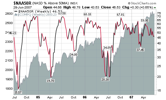
As you can see, the number of stocks above this level reached a peak of 67.81% in October of 2006 as the NASDAQ was trading near 2,300. Since then, the number of stocks trading above this level has gradually decreased from 67% to 46%. The NASDAQ has gone from 2,300 in October to 2,600 in recent weeks yet the number of stocks above their 50-d moving average has slipped by 31% (market gained 13%). I will ignore the volatile swing from February of this year and concentrate on the overall monthly trend.
The number of stocks slipping below their 50-day moving average since April 2007 has gone from 59% to 46% while the NASDAQ has gone from 2,500 to 2,600. Anyone can see the divergence that has occurred over the past three months and certainly over the past eight months. It is not normal for the NASDAQ to move higher without a strong underlying support system.
What does this tell me?
It tells me that the weaker stocks are starting to drop below their 50-day moving average support level which indicates that the market leaders and general market may soon follow. Market leaders generally slip below their support levels after the weakest stocks have already pulled back. Leaders tend to drop last and blast off first.
Let’s look at the next chart:
The percentage of NASDAQ stocks trading above their 200-day moving average
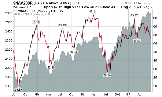
Here we see a chart that is similar to the one above over the past three months but slightly different when going back to last year. It concerns me even further that the number of stocks above this longer term moving average support line has been dropping quickly over the past two months while the NASDAQ pushes higher.
The percentage of stocks above this line has gone from 57% in early April to 48% on Friday (a 15% drop). However, the NASDAQ has gone from 2,500 to 2,600 over the same period of time.
I can’t honestly sit here and say that the market is going to correct in two days, two weeks or two months but I also can’t ignore such red flags that continually appear on secondary indicator charts. I will continue to hold my positions until the primary indicator of price and volume confirms but I will be watching closely!
*FYI: The price of the NASDAQ is in the shaded gray area of each chart if you weren’t aware.


Connect with Me