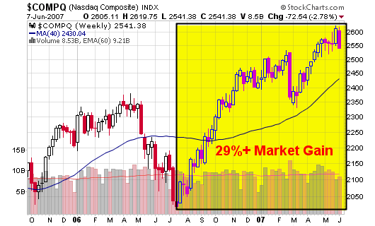
A Natural Correction or Top?

On May 24, 2007, I wrote an article titled: Are We Nearing a Top

In that article, I said:
“I am not sure if this WSJ article will signal a top but I tend to agree with Barry that this type of front page coverage has a history of signaling things to come.”

“…keep an eye on this performance chart to make sure the up-trend doesn’t extend too far without a natural pullback”

“The second chart shows the NASDAQ reaching a 28% gain over a year ago which has signaled tops in the past. Eugene D. Brody, from Oppenheimer Capital, was quoted as saying: “Sell stocks whenever the market is 30% higher over a year ago”.”

So, what can we make of the market over the past several days?

  • First, the market looks to be making a natural intermediate correction which has been overdue in my personal opinion (remember, the action in the market is only a belief in your own mind).
  • Second, the markets are extended (up 25%+) when compared to their levels from last year and I have been highlighting this fact over the past several weeks. Corrections are due when markets move up by 30% over their levels from the prior year.
  • Finally, the markets can’t continue to trade too far above their 50-d and 200-d moving averages without making a pullback, even if it only last a few days to a couple weeks. They can continue to trend higher but pullbacks are a must in order to achieve sustainability. Welcome pullbacks and add shares in ideal situations.

If you follow my annotated charts over on stockcharts.com, you may have noticed the fact that the 50-day moving average for crude oil has recently crossed above the longer term 200-day moving average (a sign that oil prices may push higher). The 200-d moving average is still facing south but things are starting to look better which usually means that stocks “as a whole” may be poised to take a breather or actually trade lower.
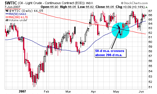
060707_crude_daily.png

Let’s take a look at several charts:

The NASDAQ is now trading a few points above its 50-d moving average and has not traded below this line since its last correction in late February 2007. That correction was short lived but did give back 8% in gains as this week’s losses have totaled less than half of that.
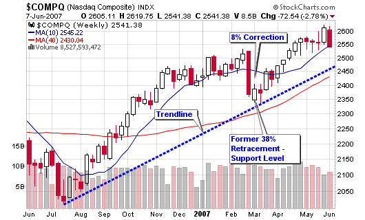
060707_nas_wkly.png

060707_nas_daily.png

060707_nas_29per.png

I did miss one BIG signal that highlighted a weak market over the past several months: a bearish divergence between the NASDAQ and its relative strength versus the S&P 500. As the index moved higher, the relative strength drifted lower; not a very promising occurrence.
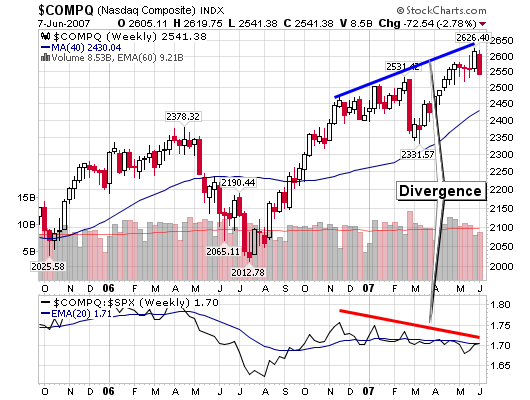
060707_nas_div.png

The DOW was down about 3% for the week on above average volume which gives us pure distribution. Looking at the point and figure chart, I see one support level near 13,200 and then a possible free-fall towards 12,800 or 12,750 when overlaying the weekly candlesticks. The 200-day moving average sits near 12,400, an area I would rather not visit at this time.
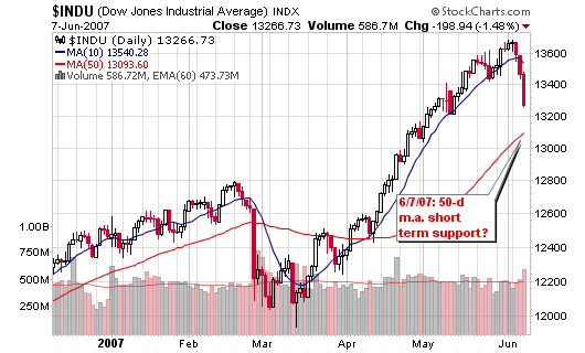
060707_dow_daily.png

060707_dow_pnf.png

Do I think the up-trend is over?
It doesn’t really matter what I think when you can follow the indicators above. However, I’ll give you my beliefs: The up-trend is making a natural correction and Wall Street analysts and newspapers are freaking. Corrections such as this are welcomed as they allow investors to accumulate shares in the top candidates before they resume their runs.

Fundamental Screens and Scans

I have been asked numerous times to shed some light on the actual fundamental screens I use to come up with the stocks I research on a daily basis. As promised in a post in April, How to Create a Successful Stock Watch List, I will now give you further detail on my fundamental screens.

As many of you know, my main tool is the Daily Graphs Custom Screen Wizard which is owned by William O’Neil & Co. Incorporated. You can get a trial subscription for 7-days on their main site but I would wait until they offer the trial for free (they do this several times per year). The screener does cost $45 per month which may sound high for one tool but it does the job for the stocks I am seeking.

I also use several screens though my brokerage account and the scan engine through stockcharts.com. It has a basic user interface and an advanced user interface for investors that can handle some basic programming. These screens locate stocks based on specific technical patterns which help me from time to time but I prefer fundamental screens to find the stocks I would like to view with my own eyes. I perform my own technical research as it allows me stay in-tune with the market on a daily and weekly basis. I can flow with the market by scanning hundreds of charts every night after the close.

Now I will disclose the top fundamental screens I use on the Custom Screen Wizard. EPS and RS ratings are based on a fundamental system created by IBD that I trust. To learn more about the EPS and RS ratings, please visit investors.com.

Please understand that I am always actively scanning these screens and some come-into favor and then fall-out of favor as time moves on. For example, the screen that locates quality stocks making new 52-week highs is best used when a market has just completed a bottom and a new bull-run or up-trend is starting to develop. This screen is less important near the end of a strong bull run as many of the stocks making new highs at this point in time are exhausted. We will see more failed breakout attempts, reversals and late stage bases so the odds are no longer in favor of this screen.

When scanning these screens, I will present the stocks in descending order starting with the day’s largest price change and occasionally starting with the day’s largest volume change versus 50-day moving average.

1. Quality Stocks within 10% of the 200-day Moving Average
The first screen I will present has been my most successful over the past six to twelve months and has been responsible for finding some of my best risk-to-reward setups:

  • Earnings Per Share (EPS) Rating: From 70 to 99
  • Relative Price Strength (RS) Rating: From 70 to 99
  • Current 50-Day Average Volume (1000): Greater than or equal to: 100
  • Current Price % Above or Below 200-Day Moving Average: From -5 to 10

2. Quality Stocks that are trading within 15% of 52-week Highs
This screen is great for finding high quality winners that are currently consolidating from recent highs and are now offering entry points for accumulating shares:

  • Earnings Per Share (EPS) Rating: From 60 to 99
  • Relative Price Strength (RS) Rating: From 60 to 99
  • Percentage price is below 52-Week High: From 1% to 15%
  • Current 50-Day Average Volume (1000): Greater than or equal to: 100
  • % Increase in Volume (Current Day) vs. 50-Day Average Volume: Greater than or equal to: 50

3. Institutional Sponsorship Increasing
This next screen looks for high quality stocks that have increasing institutional fund sponsorship from one quarter to the next. As you know, this is very important for any stocks I cover and then buy. Every case study on this blog includes detailed institutional sponsorship analysis.

  • Earnings Per Share (EPS) Rating: From 60 to 99
  • Relative Price Strength (RS) Rating: From 60 to 99
  • % of the number of Mutual Funds Owning for Current Quarter vs. Prior Quarter: Greater than or equal to: 10%
  • Stocks trading at new 52-Week High and Percentage price is below 52-Week High: From 0 to 15
  • Current 50-Day Average Volume (1000): Greater than or equal to: 100

[Read more…]

The Final MSW Index Results

I was doing some research last night and was reviewing the final MSW Index before closing the site for a new format. The MSW site closed in March and my final weekly analysis was done on 3/3/07. The MSW Index included a total of 21 stocks at the time with six of the stocks still around from 2006. Many new names were on the index with several of them highlighted here on the chrisperruna blog in 2007.

Click the Image below for the March 3, 2007 MSW Index PDF


Anyway, I was impressed with the results of the stocks listed on that final Index as I calculated their current gains/losses to date and their overall gains from the original date of coverage. Of the 21 stocks left on that final screen, seventeen of them are currently showing a gain with four of them in the red. Of the four in the red, I actually highlighted one of them as a short on this blog and would have removed it from the index had I continued to run the MSW subscription service (KNOT). Another of the red stocks is LVS which has also been cut to hold/sell in my book and was a superstar on the index in 2006. DTLK was the sole loser in this bunch as the position never worked.

The average gain of the seventeen stocks is 19% with the largest three month total going to ISE at 47%. JSDA was a close second at 46% and you must consider that the stock is far from the highs set in April. Overall, the top gainer from the initial coverage is ICE at 103% from its starting price of $73.69. The average gain from the initial coverage of each stock is 30%, about 5% higher than my target goal in my expectancy calculations.

Of the stocks that are currently up, JLL was my poorest analysis as I labeled it a sell on 3/3/07 when it was trading at $104.32. I initially started coverage when the stock was trading at $82.90 and liked what I saw but the action in March ruffled my feathers. This turned out to be the wrong call as the stock closed at $119.59 yesterday for a 15% gain since March and a total gain of 44% since the initial coverage.

Take a look at the MSW Index link above to see what I was researching at the time and then take a look at the chart in the image below to see how these stocks have performed over the past three months. I know we are in a strong up-trending market so results like these are not difficult to obtain but the win/loss percentage is still impressive for 21 stocks that have not been touched in three months. I don’t know what the MSW Index would look like today but I can assure you that several of these names would still be on the list.

060407_results.PNG

As you know, I have been buying and researching new stocks such as:

FCStone Group Inc. (FCSX)

Stock of the Day
FCStone Group Inc.
Friday’s Closing Price: FCSX – $47.96

Sector: Financials
Industry: Investment Brokerage
52-week Price: $27.25 – $48.70
Next Earnings: 7/14/07

060407_fcsx_daily.png

FCStone Group is another financial stock making its way to the “stock of the day” case studies here on the blog. Our most recent financial stock covered, GROW, decided to pop on Friday on heavy volume which was good news to everyone that established a position.

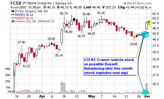
Today’s stock made my IPO screens over the weekend and saw a strong pop on Friday after Cramer noted it as one of his three stocks that may be part of the Russell rebalancing later this month. I was actually watching the show live when he named the three stocks and took a quick look at their charts but didn’t go further with my research at that time. The strong $5.67 price move along with the 358% increase in volume on Friday easily allowed it to make my weekend screens. Both the EPS ratings and the RS ratings (my main criteria for the screen) look extremely healthy so I decided to dig deeper.

The financials are below so I will start with a brief analysis of the daily and weekly charts. The weekly charts shows the stock blasting out of the IPO with a strong up-trend that lasted six weeks on strong volume. The stock consolidated over the next five weeks but volume was lower, a very positive sign. Institutional investors were holding their shares while the little guy was buying and selling.

You can see the sharp price increase above the 50-d moving average on strong volume Friday, the morning after Cramer’s buzz. Aside from the Cramer buzz and the possibility that FCSX may land on the Russell 2000, the stock is definitely one to watch from both a fundamental and technical standpoint. Due to a lack of trading history, we don’t have an ideal entry for a trade setup. Therefore, we must look to accumulate shares at or near the 50-d moving average or a new all-time high on strong volume. Look to add shares if the stock is closing the gap from Friday near $42.50 (see my potential trade set-up below).

[Read more…]

Thank You Readers!

It’s the weekend but I wanted to take the time to thank everyone that continues to visit this blog on a daily, weekly and/or monthly basis. As you can see from the image below, chrisperruna.com has been growing on a steady pace since launching on December 4, 2006.

Prior to writing on chrisperruna.com, I was blogging on my blogspot account without steady growth. Viewing this chart makes it all worth it!

I am not pulling down numbers like TraderMike or WallStreetFighter YET but anything can happen!

060207_hits.png