Follow the Leaders

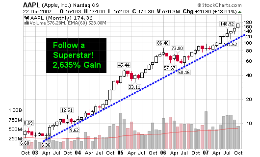
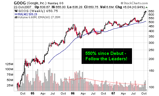
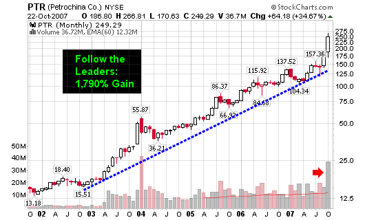
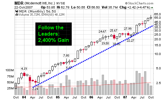
Watch the action among these leaders to truly gauge where the market is headed. Step back and view their long term charts so you don’t get caught up in the day to day MINOR movements!

Seriously, step back and throw the charts on the floor or hang them on a wall across the room and you will clearly see the trends. These stocks have been leading the market higher and will give the FIRST clues of a market looking to go lower! We did have our second major distribution day last Friday and fourth overall but these stocks will tell the ultimate story!

The major Superstars include AAPL, GOOG, PTR & MDR
The minor or more recent Superstars include BIDU, FSLR, GRMN, EDU and others on the blog. See my stocks category to find the leaders of 2007.

102307_aapl_wkly.png

102307_goog_wkly.png

102307_ptr_monthly.png

102307_mdr_monthly.png

[Read more…]

Second Major Distribution Day

We witnessed our second major distribution day as the DOW was down 2.6% on volume 40% larger than the prior trading day. The NASDAQ was down 2.6% on volume 15% larger than Thursday.

It was the worst selloff for the NASDAQ since February and the largest for the DOW since August. Volume surged across all major indexes but do keep in mind that it was options expiration day.

102007_snp_50d.png

Technically speaking, we now have 4 distribution days for the NASDAQ and 3 for the DOW over the past month. It’s now time to start focusing big-time on the market leaders to see where they are going to take this market. If they start to roll over, you better be quick to take profits and even quicker to take losses.

Here’s what I had to say last Thursday, October 11, 2007 (see the charts in this link as well: Distribution Day)

The number of stocks above their 50-day moving averages crossed above the overbought level of 80 last week and we saw our first major sell-off distribution day yesterday. This doesn’t mean you must rush today to sell all of your holdings but do understand that the next sell-off is not far from happening. Study the chart below and follow the purple line to see where and when the market had peaks and valleys as related to the number of stocks on the S&P 500 above or below their respective 50-day moving averages.

The markets flashed a heavy distribution day Thursday as the NASDAQ was down 1.4% on volume 60% larger than the previous day. This was the largest showing of volume in two months and is not healthy because it was pure distribution. It was only the second distribution day over the past month so we can’t call this a bear run but please be on the lookout for a possible correction of 5%-10%. Technology stocks led the decline as BIDU gave back 10% of its amazing run.

102007_nas_daily.png

102007_nh_nl.png

Distribution Day

The markets flashed a heavy distribution day Thursday as the NASDAQ was down 1.4% on volume 60% larger than the previous day. This was the largest showing of volume in two months and is not healthy because it was pure distribution. It was only the second distribution day over the past month so we can’t call this a bear run but please be on the lookout for a possible correction of 5%-10%. Technology stocks led the decline as BIDU gave back 10% of its amazing run.

The DOW was also down half of one percent as volume swelled 30% from the previous day.

The NASDAQ has run up more than 18% since I pinpointed the percentage of S&P 500 stocks above their 50-d moving averages crossed below the 20% oversold level. The secondary indicator was the final chart of study on August 16 as the indicator was hanging below the key 20% line as noted on this chart below (on August 16, 2007):

081607_nas_50d.png

Ironically, this was the exact bottom as the NASDAQ has been on a rampage ever since, moving from a low of 2,386.69 to a high of 2,834.00.

101207_nas_daily.png

The number of stocks above their 50-day moving averages crossed above the overbought level of 80 last week and we saw our first major sell-off distribution day yesterday. This doesn’t mean you must rush today to sell all of your holdings but do understand that the next sell-off is not far from happening. Study the chart below and follow the purple line to see where and when the market had peaks and valleys as related to the number of stocks on the S&P 500 above or below their respective 50-day moving averages.

This is only a secondary indicator but one of the most reliable while trying to look for clues to a short term market top and/or bottom. I have come to realize that the bottom signals have been more accurate than the topping signals over the past several years!

101207_nas_50d.png

Friday Morning “Chinese” Breakfast

Mike Steinhardt from HEDGEfolios uploaded a great post today Comparing China’s Stock Market to the NASDAQ of the late 1990’s. As you know, I wrote about the technical comparison on Wednesday in my post titled Is Shanghai a Nasdaq Déjà vu

Please understand that we are offering opinions based on fundamental and/or technical data. With that said, you must realize that the market doesn’t care about our own personal opinions and will do what it wants, how it wants, when it wants. So, comment on what you think about what we are presenting (both technical and analytical).

I completely agree with Mike when he says:

“The dangers in comparative analysis are heightened when we only look at the similarities and then extrapolate a similar ending. Instead, we must look at the differences as well and when we do that, we still need to avoid the expectation that the ending will follow previous examples.”

And

“The chart overlay tells one part of the story. Of course, markets are much more complex than just looking at a chart. All the factors I mentioned and many others I have not discussed make the market. The chart is just a composite image of them and by only focusing on a picture we oversimplify everything else that is going on.”

That last sentence is the most important as I would expect readers of this blog to understand that we never try to predict anything and that technical tools are just a portion of your overall system. We as humans do tend to oversimplify markets when plotting them on a chart, forcing our eyes to see repeating patterns (that may not be there).

“I wouldn’t make a new entry into China’s stock market but then again, I have been saying that for over a year – a year in which the SSEC has gone up about 200%.”

I have taken part in the mania with individual stocks in the Chinese market in 2007 but I am becoming skeptical of the sustainability of the current rise. Is this due to my over-analysis of what may happen based on past events? Am I playing games with my own mind by trying to see something that is not there?

Maybe, maybe not! I took a position in my sixth Chinese stock (of 2007) this week and it’s showing a quick profit but I am skeptical as it was a pure spec play. I have a tight stop and I am not leaving much room for disaster in case things start to turn on a dime. As said on Tuesday, I was keeping my exposure low with a smaller than normal position (a very tight R factor).

Maybe the bubble will burst in China, maybe it will deflate slowly and then move even higher; whatever the case, I will take my individual signals while keeping an eye on the bigger picture. Thank you for the analysis Mike, I really appreciate your input.

“Will the chart of the decline mirror the pain we felt on the Nasdaq? I have no clue.”

Neither do I!

Is Shanghai a Nasdaq Déjà vu

The rise of NASDAQ in the late 1990’s has been compared to the rise of the Dow of the late 1920’s. Chart overlays are amazingly similar.

100207_dow_nas.png
Image from BullandBearWise.com

Well, the current two year rise of the Shanghai Stock Exchange Composite Index looks remarkably similar to the rise of the NASDAQ of the late 1990’s and the charts below explain better than I can!

100207_nas_up.png

The NASDAQ rose from 1,250 to 5,132 from March 1997 to March 2000: 310% gain!
The Shanghai Stock Exchange has moved from 998.23 in June 2005 to 5,552.30 today (10/2/07): 456% gain!

100207_shanghai.png

As you can see, the blue line of the late 1990’s NASDAQ has moved meticulously with the Shanghai Index of today.

100207_nas_shang.png

Will the Shanghai Stock Exchange end up with the same result as the NASDAQ of the late 1990’s. As you can see, the NASDAQ went from 1,250 to 5,132 back down to 1,192 (all within a five year period).

100207_nas_rise_fall.png

This won’t happen overnight but human nature always repeats so expect a huge decline in the Shanghai Stock Exchange within the next several years.

1929, 1999, 2007, etc…

“Wall Street never changes, the pockets change, the stocks change, but Wall Street never changes, because human nature never changes” – Jesse Livermore.

“The price pattern reminds you that every movement of importance is but a repetition of similar price movements, that just as soon as you familiarize yourself with the actions of the past, you will be able to anticipate and act correctly and profitably upon forthcoming movements” – Jesse Livermore

“All through time, people have basically acted and re-acted the same way in the market as a result of: greed, fear, ignorance, and hope – that is why the numerical formations and patterns recur on a constant basis” – Jesse Livermore